I see what you mean now, thanks. My one issue with your method is that it pushes november and december one year back so the years are misaligned in that sense. The FY chart (or rather, a chart aligned at first FQ4), would solve this. This is a shipment chart, of the respective consoles, for example, using that method:
|

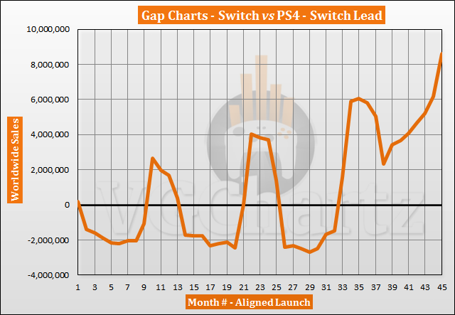
Thank you for explaining this chart, I see that it is similar as each Quarter will be compared with the same months so you prevent the double helix. It does create a padding that favors whatever console you place as a "0". if you were to put the switch as a "0" (it would actually need to be -2. -1 and 0). Then you would get a huge padding in favor of the switch that would have it ahead after 15 quarters. (it would be higher than the DS and pretty much tied with the Wii).
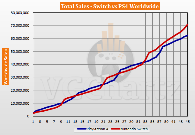
But in general I feel that with this Fiscal aligned and Launch Aligned if you see the graphs you get a feeling that the wii is with quite a lead but it is losing ground, where as the month aligned gives the impression that the NS passed it and it is not looking back. In this case, for me it seems that in the end, the true scenario is more like the second one, were the NS will beat the Wii by a lot.

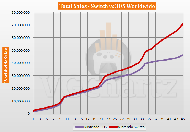
In particular, the comparison between the NS and the DS is a big difference.

According to this month aligned, the NS is actually ahead of the DS. But this comes with a huge asterix, as december for the DS is over 7.5 million, so there is no chance the NS keeps this lead for next month.
There are definitely pros and cons for each graph, but in the end, all of them are fun. The launch aligned leads to a constant back and forth that is motivating for people that want each console to sell more. The fiscal is better aligned than the launch, but it seems to give a big boost to the console that is year 0. The monthly seems to me like a good choice when comparing consoles that launch in different months.