By using this site, you agree to our Privacy Policy and our Terms of Use. Close

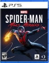
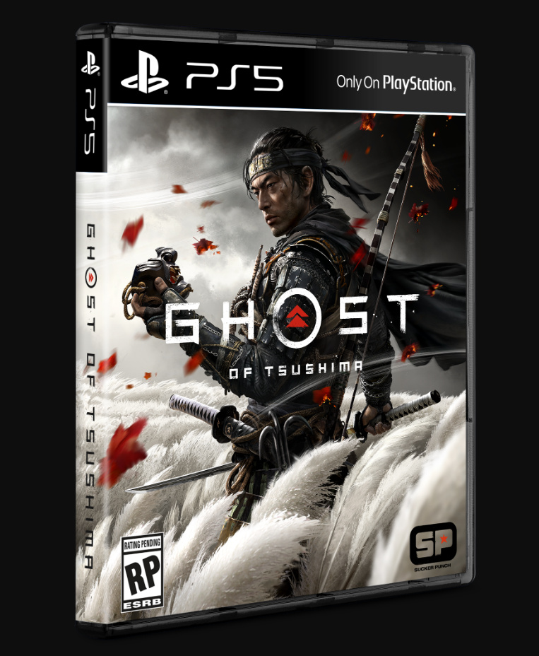
Forums - Sony Discussion - First look: Box art for upcoming PS5 games (Spider-Man/ Godfall)

Tagged games:

jakemania said:

I too would prefer black case/banner with white logo/text:

This looks really good and is much better than Miles version.

If it were me, I'd make the front top label look sorta like the console shape. Thinner at the PS5, then flare out gently at Only On PS to the opening side.

I'd also go white strip on the bottom and top, again resembling the console. White outer, black inner, symmetrical, horizontal.

Have the box art show through the thin gap above the PS symbol and PS5 area, as well as the thin gap to the right of Only On PS, where the white extends to the edge of the box but the inner black stops just short, like the console.

*Same idea but vertical along the spine would work as well. You could even make it so the front was only showing the right half of the console standing vertically. Or make the entire spine the console middle so that when the box is fully open, the right and left of the spine are the left and right third of the console, front and back.

*Hmm. What about the optical disc bulge though? To leave that out on the box art would seem totally meme worthy actually. I do think the digital version symmetry would look better. Just assume it takes after the upper top/far right portion of the console I guess?

Last edited by EricHiggin - on 10 July 2020

Around the Network
Machina said:
shikamaru317 said:

Spider-Man is going multiplat, didn't you hear? 

Just kidding. Not sure why it isn't present on the boxart. 

Perhaps they've just dropped the label for PS5, because they intend to release more of their exclusives on PC (like they're about to do with Horizon: Zero Dawn), and don't want to be accused of false advertising. Obviously too late with Horizon: Zero Dawn, but not for future games.

I think they should still use it, to stand out a little. I mean, it's true at the time of the original release, even if it goes to PC a few years later.


A 13 year old could have probably photoshopped a better cover.


PS4 case looked better, actually, the better Sony has ever done imo


Switch!!!

The case should be black


Around the Network

Only thing I don't like is the white banner. Should be black with white font like the pics posted in this thread.


I personally like it. I know some may not like the white, but when you look at it, you can tell it matches the colors of the PS5.

I may be over thinking this, some mentioned that they don't like the blue case, but what if they're keeping the blue case because its the same as the PS4 and since the PS5 backwards compatible that's how they're keeping it together? ...or they just kept the blue case cause they already have been mass producing it so didn't want to waste it lol


Looks like ass. Needs a black or white case if they're gonna use that banner.


4 ≈ One

This case has me reconsidering the Digital Edition. XD


4 ≈ One

Sorry if I missed it in the comments, but I realized it doesn’t have “only on PS” in the top right. Is that a typo or are they adopting the PC release route?


Xbox: Best hardware, Game Pass best value, best BC, more 1st party genres and multiplayer titles.