
rolltide101x on 19 January 2017
I do like the look of that. Looks efficient


No internet browser? Also yeah, I'd like to be able to see more apps at once.

Single row? Make that layout customizable via Settings.
Guess its suffficient for launch, or if you can only have a couple of games installed at a time.
And look, Nicalis software that will never reach the European eShop, guess you'll have to buy them through an American account.
---
Some already found out the title at the edge, it's Hydra Castle Labyrinth
http://nintendoeverything.com/nicalis-also-seems-to-be-planning-hydra-castle-labyrinth-for-switch/
https://www.youtube.com/watch?v=zSZ_rpqL-bM
Why only one row? I like the 3DS one, with a grid of icons. Faster to navigate. Also the Netflix one with rows with different meaning is OK. But this one? If I have as many download games as I have on 3DS, shall I need hours to move to the one I want?

Are the mii characters not a thing now? Because from that pic, on the top left he had a inkling picture.
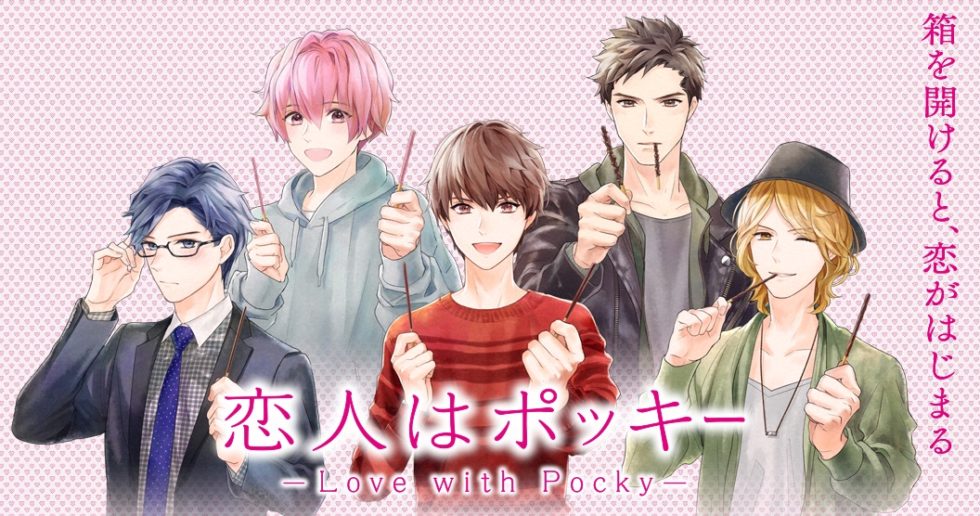
Pocky Lover Boy!
RolStoppable said:
The 3DS also has only one row. |
You are able to change it to multiple rows.
Pocky Lover Boy!
I like it! Minimalistic
I'm on Twitter @DanneSandin!
Furthermore, I think VGChartz should add a "Like"-button.
RolStoppable said:
The 3DS also has only one row. |
Right, in standard config. I totally forgot since I have changed it for years now. So hopefully it can be configured to be a grid on Switch too.


I will miss the WiiU UI, but I like this new one as well.

---Member of the official Squeezol Fanclub---
About Us |
Terms of Use |
Privacy Policy |
Advertise |
Staff |
Contact
Display As Desktop
Display As Mobile
© 2006-2026 VGChartz Ltd. All rights reserved.