By using this site, you agree to our Privacy Policy and our Terms of Use. Close

Forums - Nintendo Discussion - Skyward Sword: Realistic graphics Vs Cell Shaded (Pics)

Below it is a Garry's Mod of the Skyward Sword scene and comparison pics from the actual game.


-----------------------------------\\-----------------------------------------------\\----------------------------


I don't know about you guys, But I think I do prefer Skyward Swords own art style...


Around the Network

They actually made cell shaded skyward sword look sooo lame.......


I love cell shading (cf Borderlands, Red Steel 2). I really liked Wind Waker's artstyle, pushed over by the cell shading, which helped improve the magical feeling all Zelda have.


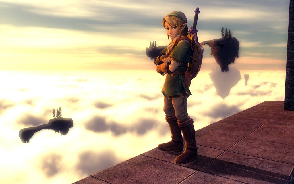
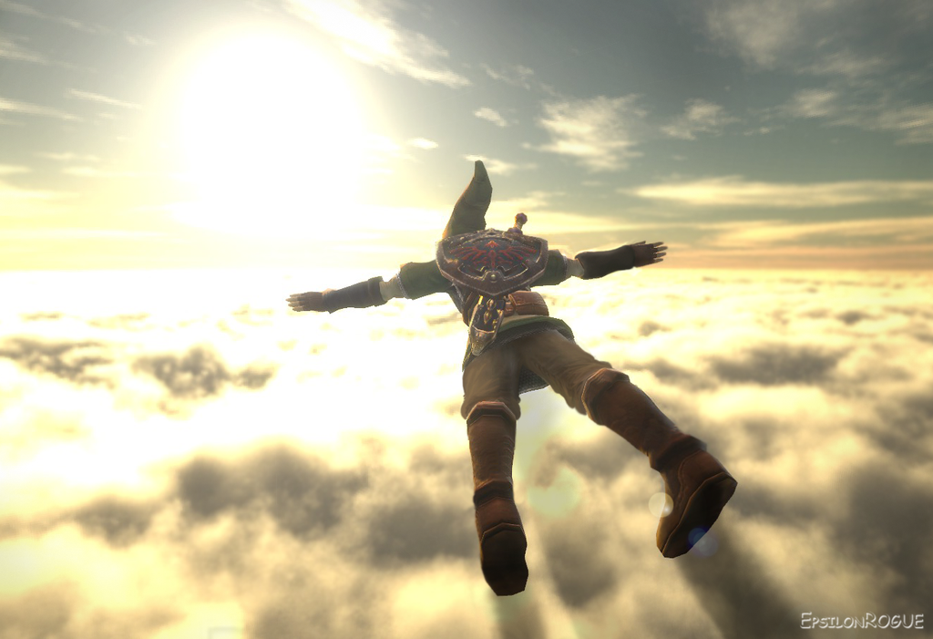
Oh man... I so prefer the realistic art style of Twilight Princess. I think Zelda should be something epic, huge and with a giant world to explore. I always hoped Nintendo would (at some point) make Zelda a bit more like Lord of the Rings, with epic battles and great nature around you.

Cell Shading looks really great in a lot of games but it just doesn't fit Zelda games at all. The whole background story with the gods, Hyrule, Link and Ganondorf... all these things just don't fit into a game with Cell shading.

I would love to battle a giant enemy in Zelda (like in Shadow of the Colossus) and have Nintendo include darker environments. The first screenshots of Twilight Princess suggested this, actually. They were dark, epic and made you expect a game with a more... "unfriendly" overworld. But then they even fiddled in their stupid "bling bling colors" into Twilight Princess.

To be honest I am not hyped for this Zelda game at all. And I've never experienced this with a Zelda game before.

And come on people, let's just say it: They put the Cell Shading in there because it is way easier to make. The basic difference between Cell Shading and normal graphics is that you don't need to put effort into designing the textures. Take Twilight Princess' graphics, make colors shine bright and remove the textures and tadaaa you've got Skyword Sword.


Realistic graphics are much better for the Zelda franchise imo.


Around the Network

I think Skyward Sword's graphical style really turned off a lot of people because Nintendo presented the game when the graphics were in an incomplete state. With a year of polish I think the final version of the game will look great, and make a lot of people who were initially disappointed change their tune.


The realistic gfx here are pretty brilliant, I approve of them.


I love cell shaded graphics. But Skyward Sword just looks extremely dull. I hope they improve on it a lot in the remaining time.


I loved the Wind Waker cell shaded style

But something about the skyward sword style just doesn't feel right, too drab and dull.

Realistic is better here.


All hail the KING, Andrespetmonkey

I hope they get rid of anything that would get in the way of making the game fun (sailing in Wind Waker, slow opening in Twilight Princess, Temple of the Ocean King in Phantom Hourglass*) before they try to wow us with graphics. Having loads of fun in a game doesn't have an expiration date, unlike flashy graphics.

* Haven't played Spirit Tracks, so I don't know about how that game is overall.


A flashy-first game is awesome when it comes out. A great-first game is awesome forever.

Plus, just for the hell of it: Kelly Brook at the 2008 BAFTAs