By using this site, you agree to our Privacy Policy and our Terms of Use. Close

Forums - Gaming Discussion - Xbox and Sony's Next Gen Box Art

Tagged games:


Do you like the next gen Box art?

PS5 is better 19 33.33%
 
XSX is better 16 28.07%
 
Both are meh.. 22 38.60%
 
Total:57

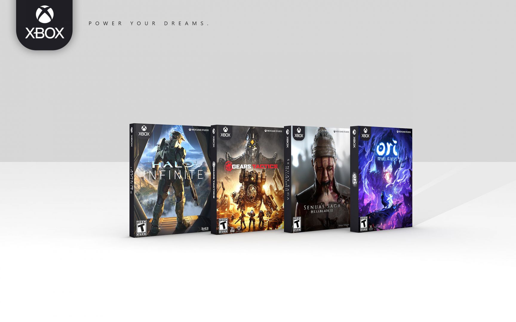
I don't get some of you who says the Xbox case looks way better. It looks almost exactly the same as the Xbox One case. If PS5 had the exact case as the PS4, we would see some heavy critiques here to put it mildly.

I'm not trying to rag on the Xbox case, but it certainly doesn't look WAY better at all. I know tho....opinions and preferences.


PSN ID- RayCrocheron82

XBL Gamertag- RAFIE82

NNID- RAFIE82/ Friend Code: SW-6006-2580-8237

YouTube- Rafie Crocheron

Around the Network

The edge is the only thing that will be facing me off my shelf. They'll be fine.


...to avoid getting banned for inactivity, I may have to resort to comments that are of a lower overall quality and or beneath my moral standards.

Well the art for XSX confirms you can just buy that disc and instal in either system, curious on how the data structure will be handled and if you'll need to download some of the data for XSX.


duduspace11 "Well, since we are estimating costs, Pokemon Red/Blue did cost Nintendo about $50m to make back in 1996"

http://gamrconnect.vgchartz.com/post.php?id=8808363

Mr Puggsly: "Hehe, I said good profit. You said big profit. Frankly, not losing money is what I meant by good. Don't get hung up on semantics"

http://gamrconnect.vgchartz.com/post.php?id=9008994

Azzanation: "PS5 wouldn't sold out at launch without scalpers."

They need to show us the same box art for the same game to be able to draw better comparisons.

I don't like that white band at the top of the Ps5 case, but I don't like the green cases for xbox games.

Other than that, ps5 looks cleaner and the xbox looks to busy. Prefer the cleaner look, but I think the white band needs to go. It just feels like it shouldn't be there, just like the series x badge.


Switch.


Around the Network
BraLoD said:
The XSX is really poluted.

And still PS5 looks worse, that tell volume about the bad choice of colors of PS5 box.


duduspace11 "Well, since we are estimating costs, Pokemon Red/Blue did cost Nintendo about $50m to make back in 1996"

http://gamrconnect.vgchartz.com/post.php?id=8808363

Mr Puggsly: "Hehe, I said good profit. You said big profit. Frankly, not losing money is what I meant by good. Don't get hung up on semantics"

http://gamrconnect.vgchartz.com/post.php?id=9008994

Azzanation: "PS5 wouldn't sold out at launch without scalpers."

Fei-Hung said:
They need to show us the same box art for the same game to be able to draw better comparisons.

I don't like that white band at the top of the Ps5 case, but I don't like the green cases for xbox games.

Other than that, ps5 looks cleaner and the xbox looks to busy. Prefer the cleaner look, but I think the white band needs to go. It just feels like it shouldn't be there, just like the series x badge.

Yes, removing the bar would improve PS5 box a lot. Ireally liked the black version.


duduspace11 "Well, since we are estimating costs, Pokemon Red/Blue did cost Nintendo about $50m to make back in 1996"

http://gamrconnect.vgchartz.com/post.php?id=8808363

Mr Puggsly: "Hehe, I said good profit. You said big profit. Frankly, not losing money is what I meant by good. Don't get hung up on semantics"

http://gamrconnect.vgchartz.com/post.php?id=9008994

Azzanation: "PS5 wouldn't sold out at launch without scalpers."

I still the PS5 box design is lazy and uninspired. But damn the Xbox version is just confusing. Can people buy that game and stick it in their Xbox One? Will publishers ship specific skus just for last gen Xbox One versions of games? It seems like a marketing nightmare.


http://www.youtube.com/watch?v=F1gWECYYOSo

Please Watch/Share this video so it gets shown in Hollywood.

shikamaru317 said:

Voted for both are meh. Blue and white on PS5 doesn't look good at all, while Xbox basically just reused their current cases and slapped an obnoxious gigantic "Optimized for Series X" badge on it. What a lazy offering from both. I wanted something like these:

At least the Xbox Series one will be decent once the cross-gen period ends and they can stop using the "Optimized for Series X" badge. PS5 one is always going to be ugly to me.

This book/manga look is much better than what both tried.


duduspace11 "Well, since we are estimating costs, Pokemon Red/Blue did cost Nintendo about $50m to make back in 1996"

http://gamrconnect.vgchartz.com/post.php?id=8808363

Mr Puggsly: "Hehe, I said good profit. You said big profit. Frankly, not losing money is what I meant by good. Don't get hung up on semantics"

http://gamrconnect.vgchartz.com/post.php?id=9008994

Azzanation: "PS5 wouldn't sold out at launch without scalpers."

Captain_Yuri said:

I like the ps5 one for now cause the xbox one has too much going on.

Xbox
Xbox Series X . Xbox One X - 4k - HDR - Smart Delivery
Optimized for
Series X

It's a lot of info which is good for the consumer but it makes it look less clean compared to Ps5 which is essentially like. Ps5, take it or leave it. It reminds me of cars with a ton of bumper stickers.

I agree.  I find it funny how Sony's Playstation console names are very straight forward while Xbox can be a bit much for consumers, but yet Sony's mobile Xperia names are some of the most confusing product names in history.  I can imagine the upgraded PS5 to be called the PS5 II lol

And does the Xbox next gen box art looks exactly the same but all they did was took off the word 'one' from the green banner at the top?