curl-6 said:
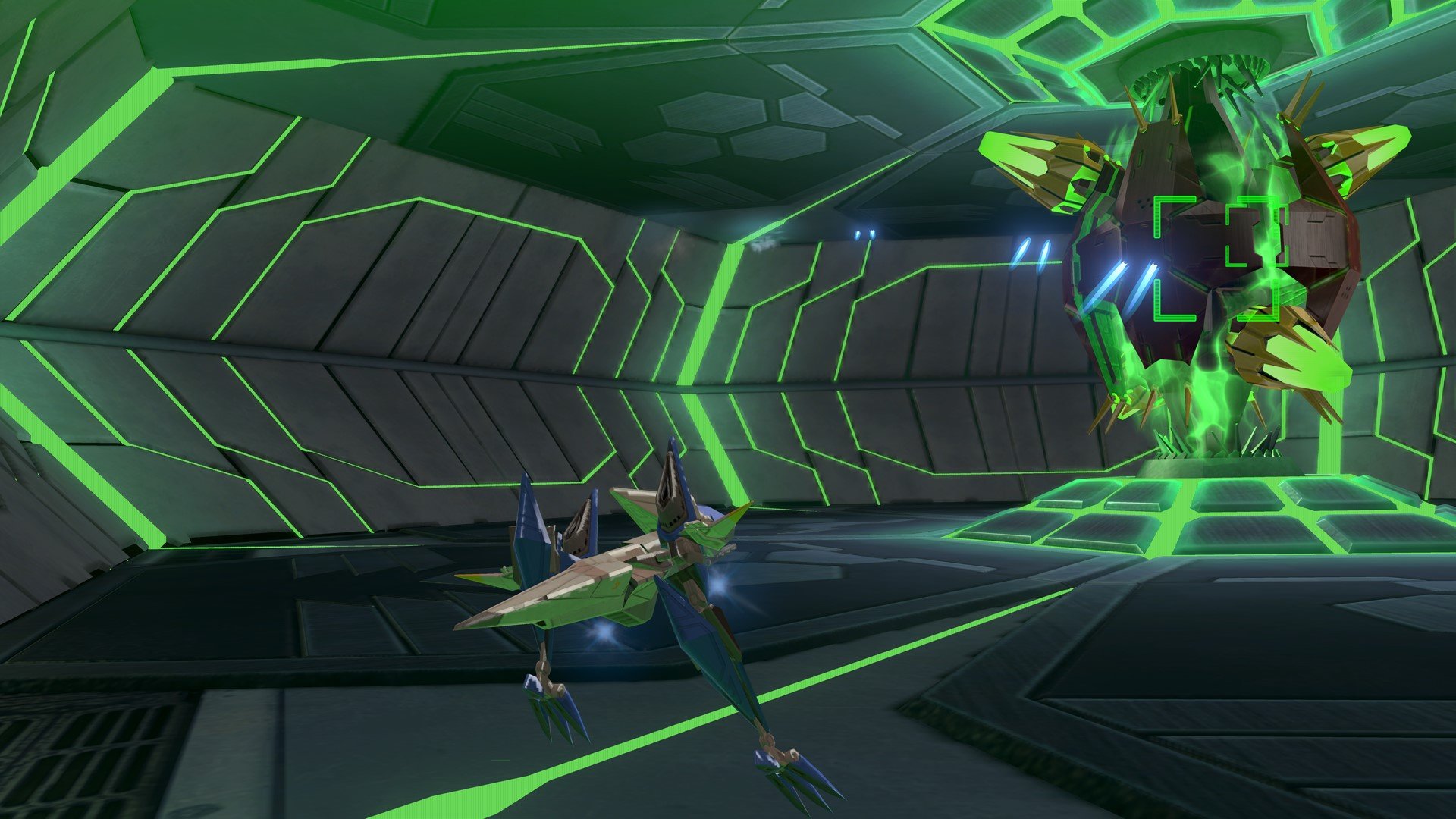
Your specific criteria were: "one screenshot of a city in Zero that has as much architecture and buildings, nay, halfas much, as what is in this screenshot of a game that came out over 10 years ago on a the GCN. "
This shot clearly meets those criteria.
|
Then I should have clarified that it when I said "city," I meant that it should actually look like a city with buildings actually look like buildings instead of assorted toy-like shapes that surrond a big gaping floor nothing. My mistake. I thought the picture was enough to make that distinction clear.
But no, the shot does not meet the criteria. Try again. Just one.