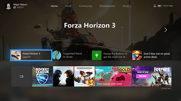
urrent Home screen
I look a little quick copy and past job over the major Nelson image of the Home page and how Im think it Should actually look. To much of the screen is currently "dead space" so to speak and could be filled with much more usefull information.
Current Home screen
My copy and paste job of that I want it to be :)
- Your games & apps tile along with you last 11 played games or apps for even easier access to them.
- The Game Image and name that currently takes up the entire top half of the screen could be moved to where I drew the red box to stop it taking up half the Home page.
- I'm happy with the deals with gold tab/a sponsored game pre-order ad or link to a currently ongoing sale.
I have it set so I just press down once and it takes you to the Pins area but seeing your recent games in 3x4 square would be so good for me as I wouldn't hardly need to browse through all my games and apps and get into games I play regularly nice and fast.
In a way I think if you got used to things the new Guide has basically everything on that you would probably never have to use the Home page to access stuff.