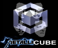
Metallicube on 23 August 2012
how bland..


how bland..


Minimalistic. Stunning. Revolutionary.


My prediction threads:
Wii U will sell under 40m units (made on 14th September 2012)
PS Vita will sell under 20m units (made on 30th September 2012)
Wii U will sell under 7m in 2013 - I was right


love it


I don't like it
Should have the windows like this
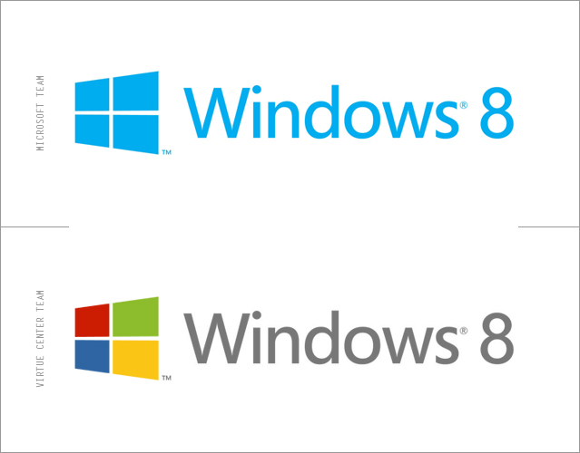
This logo even causes that optical illusion effect - the one you see a dot when the lines cross


| man-bear-pig said: Minimalistic. Stunning. Revolutionary. |
Magical.
WHERE IS MY KORORINPA 3
| kowenicki said: Natural progression and in keeping with the new UI
At least they haven't added some horrendous and meaningless strap line. I HATE those things. |
"People Ready", "Start Something", "Making it Easier", "Where do you want to go today?", "Your Potential, Our Passion", "Be What’s Next".. are some they've used.
I like the new font, anybody know what it is? edit: Googled it, they're using "Segoe".
About Us |
Terms of Use |
Privacy Policy |
Advertise |
Staff |
Contact
Display As Desktop
Display As Mobile
© 2006-2026 VGChartz Ltd. All rights reserved.