dallas said:
man-bear-pig said:
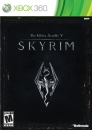
Minimalistic. Stunning. Revolutionary.
|
They basically took a lot from the Google logo....
|
How do you figure this?
This is Windows 1.0 released Nov 20, 1985

This is Windows 3.0 released May 22, 1990

This is Windows 95 released Aug 24, 1995

WiiBox3 said:
PSwii60 said:
WiiBox3 said:
Clean and simple. Very nice. |
Simple and clean. It's an insignia they wield as a representation of their kingdom. I hearts it
|
Are you saying that Kingdom Hearts 3 is coming to the 360?
|
I'm glad somebody gets my comment  The whole sentence is a Kingdom Hearts reference. It would most likely be multiplat anyway given than FFXIII was, and Tetsuya is looking to return the series to a home console.