


Mnementh on 05 August 2019
I love good data journalism and the New York Times provided an excellent piece of data journalism. A map of who has the most donors in which region:

This sea of blue for Sanders is just dazzling. So much he drowns out other candidates, which is why they made a map without him:
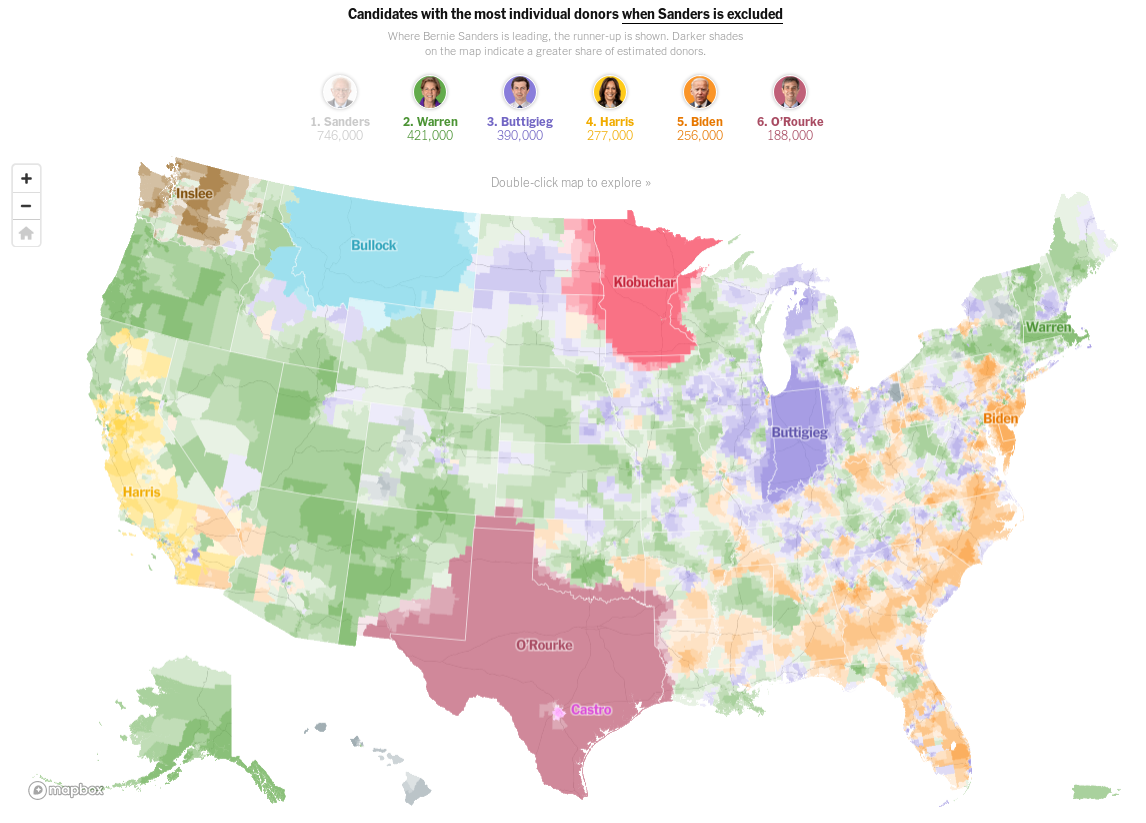
This is so excellent. I really recommend you go to the article as it shows more data and maps for each candidate and the maps are actually explorable, you can zoom into them and see second and third place for each place.
This data is possible as all donor-data for this democratic primary is processed through ActBlue and the data is from them.