By using this site, you agree to our Privacy Policy and our Terms of Use. Close

Forums - Website Topics - The official VGChartz 2.0 Thread

While I see no problem with the font colours, here's what the Internet has to say about it:

http://www.456bereastreet.com/archive/200608/light_text_on_dark_background_vs_readability/

http://veerle.duoh.com/blog/comments/my_view_on_light_text_on_dark_background_vs_readability/

http://www.blogcatalog.com/discuss/entry/white-text-on-black-background-hard-to-read

http://www.webmasterworld.com/forum36/1655.htm


Conclusion: While it may seem perfectly fine, it looks like the majority of the world's population disagrees on light font over dark background being "acceptable". That means that selecting such a scheme perhaps is a poor choice, particularly when making it the only option.


 SW-5120-1900-6153

Around the Network

I am Loving 2.0

I didn't care for it at first, but now that I'm used to it. I love it.

Good work.


thetonestarr said:
While I see no problem with the font colours, here's what the Internet has to say about it:

http://www.456bereastreet.com/archive/200608/light_text_on_dark_background_vs_readability/

http://veerle.duoh.com/blog/comments/my_view_on_light_text_on_dark_background_vs_readability/

http://www.blogcatalog.com/discuss/entry/white-text-on-black-background-hard-to-read

http://www.webmasterworld.com/forum36/1655.htm


Conclusion: While it may seem perfectly fine, it looks like the majority of the world's population disagrees on light font over dark background being "acceptable". That means that selecting such a scheme perhaps is a poor choice, particularly when making it the only option.

How about red text on black backgroud?. That should be readable, Right?

Everybody loves red on black, right? Right?


twilit said:

The contrast is fine n my screen I can easily distinguish the text from the background. You coud always try manually increasing the contrast and vibrence of your pc monitor to see if that helps.

Though, I must agree with the overuse of flash. I also.share a common complaint about not being able to open a new tab from the bar at the top. Fortunatly ioi said there may very well be a mobile version later on.

Generally i'm going to keep my final thoughts until about a few weeks after the 2.0 launch, though.


I'm not trying to be rude.

But why do you think a user should tune their monitor for one site? When they obivously don't have any problem with 1000s of other sites?

It is the designer's concern about readability.


Light text on dark backgorund might work on well spaced sites. But definitely not with this crowded sites.

I'm not being a hater. I'm just giving my opinion as a freelance web designer.


The overuse of flash on this site makes the site really slow. Slow to load, slow to scroll.


Also with the mobile version of the site. It's nice to have but you have to know that many people prefer to load the full site even on their phone.

I still can't think of a good reason to use flash for the whole top portion of the site when there isn't even any animation.


oh i wish we had the option of going to the old version.
Not to be rude, great content, but its just too bloated. Its one of the reasons I don't visit IGN.
Simplicity was what made google good.


Around the Network
liquidninja said:
thetonestarr said:
While I see no problem with the font colours, here's what the Internet has to say about it:

http://www.456bereastreet.com/archive/200608/light_text_on_dark_background_vs_readability/

http://veerle.duoh.com/blog/comments/my_view_on_light_text_on_dark_background_vs_readability/

http://www.blogcatalog.com/discuss/entry/white-text-on-black-background-hard-to-read

http://www.webmasterworld.com/forum36/1655.htm


Conclusion: While it may seem perfectly fine, it looks like the majority of the world's population disagrees on light font over dark background being "acceptable". That means that selecting such a scheme perhaps is a poor choice, particularly when making it the only option.

How about red text on black backgroud?. That should be readable, Right?

Everybody loves red on black, right? Right?


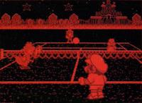
Red on black is the worst, just look how they use red text for all the sony categories. Also the Virtual Boy used red on black and look how that turned out.


Ok can someone xplain why the sig edit isn't working?? as you can tell my sig is messed up, i dont thing that text box in edit sig properly illustrate the actually boundaries or vice versa..it looks the way i want it in the edit box but when I save it, it doesnt translate well


The Ghost of RubangB said:
Xxain said:
DarkNight_DS said:
Still slugish on my laptop... not as bad as yesterday but still needs to run faster. Also, what is with the 360 controller in the logo? That kinda sends the wrong message don't you think? Why not just keep it basic without a controller in the logo? The users online thing's font in the top right is still heavily aliased and hard to read.

its a N64 controller,,I thought the same thing at first too

N64 controllers have 3 handles, not 2.  And one analog stick in the middle.

Anyone ever even use the middle handle?  I guess maybe people with small hands but using the middle handle renders the L button useless / unable to reach in quick manner.  I always just griped it from the two sides.  I have 2 radioshack N64 controllers which use a way better / more sturdy analog stick (instead of all plastic analog it is made of metal type material).


I like the new layout and it's different. I have to get use to it but that shouldn't take too long :). I haven't found any links that are broken or discovered any bugs, however, if I do I will let you know. Thanks again and great job with the new version!


sethnintendo said:
The Ghost of RubangB said:
Xxain said:
DarkNight_DS said:
Still slugish on my laptop... not as bad as yesterday but still needs to run faster. Also, what is with the 360 controller in the logo? That kinda sends the wrong message don't you think? Why not just keep it basic without a controller in the logo? The users online thing's font in the top right is still heavily aliased and hard to read.

its a N64 controller,,I thought the same thing at first too

N64 controllers have 3 handles, not 2.  And one analog stick in the middle.

Anyone ever even use the middle handle?  I guess maybe people with small hands but using the middle handle renders the L button useless / unable to reach in quick manner.  I always just griped it from the two sides.  I have 2 radioshack N64 controllers which use a way better / more sturdy analog stick (instead of all plastic analog it is made of metal type material).


It's actually the boomerang controller