
Kantor on 22 May 2009
I love it!
One thing, though. The Wall on the profile is kind of oddly placed. Can we rearrange our profile?
![]() (Former) Lead Moderator and (Eternal) VGC Detective
(Former) Lead Moderator and (Eternal) VGC Detective ![]()


I love it!
One thing, though. The Wall on the profile is kind of oddly placed. Can we rearrange our profile?
![]() (Former) Lead Moderator and (Eternal) VGC Detective
(Former) Lead Moderator and (Eternal) VGC Detective ![]()


I really really dislike the orange and grey. Its boring and generic color in most boards makes them unattractive. It ugly makes you just not wanna post =/
Also wish we could actually move our game collections around not forced to still have in console order. Oh and front page is too cluttered and lots of blank areas....its looks weird.
I can get use to it but still feel clunky and Ive yet to see new features but I havent browsed much yet =P

| twingo said: wn behh i cant just right click and open what i wan tin a new tab, is it casue its falsh ? Looks good though. Don't like the yellow brown color. |


I can't identify links any more!

Looks badass so far.
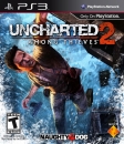
Currently playing on PS3: God of War III
Currently playing on Xbox360: Final Fantasy XIII
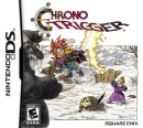
Currently playing on NDS: Chrono Trigger

The management team page is a bit confudled half way down with the text and pictures un-organised etc.
I think 2.0 looks very nice and flashy
"Recent threads" doesnt appear on homepage
I got to go home.I'm actually still at work and I close a half hour ago XD . I'll enjoy this tomorrow.
| The Ghost of RubangB said: I can't middle-click on stuff at the top of the site (charts, news, games) to open a few in new tabs. I could do that on the old one, which had a similar pull-down menu feature. |
No offense intended, but this new design is really bad. It tries to be nicer on the eye, which is a matter of personal taste, but what it really does it is kicking the usability out very badly. Maybe the unique content will keep the site afloat, nonetheless.
About Us |
Terms of Use |
Privacy Policy |
Advertise |
Staff |
Contact
Display As Desktop
Display As Mobile
© 2006-2026 VGChartz Ltd. All rights reserved.