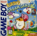
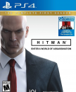
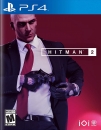
This is waaay better than the first cover
![]()
jeez.. well, I like it. I think this is actually what stands out in this mess off shovelware crap. It gets the point across.
Btw. Amazon changed the boxart as well, so it could very well be the offical one.
This is waaay better than the first cover
![]()
jeez.. well, I like it. I think this is actually what stands out in this mess off shovelware crap. It gets the point across.
Btw. Amazon changed the boxart as well, so it could very well be the offical one.
LOL, looks like super retro, I like it.
I'm Unamerica and you can too.
The Official Huge Monster Hunter Thread:
It looks okay, not good but not bad, like some people say it looks corny. i think it fits Duke Nukem games more than this, But atleast its not this one. this one looks like a retarded 7 year old who likes shiny shades and have a water gun.

Guys, Animal Crossing: City Folk doesn't have a Wii Speak logo on the box either, so this might be legit.
(>'.')>

| vdoesntforgive said:
|
I like it!
And damn, the game is rated 'TEEN'. Don't think I like that... FPS are the only genre in which I perfer games to be rated 'M'. The discriptors will probably be "Violence" and "Animated Blood". I think Call of Duty: World at War would've been rated 'TEEN' as well if it weren't for all the potty mouths in the game.
Anyways, day one.
Looks alright.
- "If you have the heart of a true winner, you can always get more pissed off than some other asshole."
I think that boxart would attract some non hardcore gamers and that's always good.
| SmokedHostage said: I personally like it, I'm tired of CGI box-art. We need more concept art like covers. :P |
This.
About Us |
Terms of Use |
Privacy Policy |
Advertise |
Staff |
Contact
Display As Desktop
Display As Mobile
© 2006-2025 VGChartz Ltd. All rights reserved.


