
vess13 on 04 April 2009
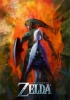
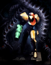
meh, it's too much of a cluster#$!@.
it shoulda been something simple like MadWorld or Twilight Princess if you ask me...


meh, it's too much of a cluster#$!@.
it shoulda been something simple like MadWorld or Twilight Princess if you ask me...


I don't see what's wrong with it... it's nothing amazing... but then I have seen very few boxarts of any games I consider better than average.
It's one of the things gaming hasn't done right yet.... there are many great book covers, album covers, and to a lesser extent DVD covers, but only a minute percentage of game covers are more than "decent".
All I ask of a cover at the moment is to get the job done in terms of appeal... and this does that IMO.... (whether it is the real one or not) this is a good cover for getting people interested in the game if they haven't previously heard of it (ie the "masses" who don't frequent websites like this)
If it had what some of you are asking, something simple perhaps with not much on it to explain the content of the game, then perhaps it would please the few people who value things like that somewhat, but then if the cover doesn't tell the rest of the gaming masses what the game involves, they might not buy it.

^ yes I'm sorry I forgot about the ppl who get distracted be bright lights...
The art direction of this game has always been its weakest point so it wouldn't surprise me if this was the final box art
Never argue with idiots
They bring you down to their level and then beat you with experience
it kinda fails
You should be beaten, burned to ashes then someone should throw your ashes from a plane

i like it though it is the game i am looking forewerd to not the box.
| R.I.P Mr Iwata :'( | ||
 |
|
|
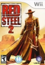
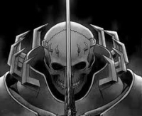
I agree with the comment made before about the concept art covers. However, I founf the black cover far more intiguing and 'kewl'

I think it looks very good.
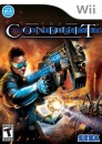
Those have got to be the ugliest shades I have ever seen... Why?
Also, it seems kinda strange... like, It just seems... Over-pizzazed. Too Explosiony red... I would have appreciated it if this boxart was a little cooler-colored...
About Us |
Terms of Use |
Privacy Policy |
Advertise |
Staff |
Contact
Display As Desktop
Display As Mobile
© 2006-2026 VGChartz Ltd. All rights reserved.
