By using this site, you agree to our Privacy Policy and our Terms of Use. Close

Forums - Politics Discussion - Record Temperatures

Ka-pi96 said:
Bofferbrauer2 said:

Once Miami can't fight off the sea level rise anymore (Miami is the most threatened city in the world from rising sea levels, with New Orleans in close second spot. Already now you can find stagnating water in some streets in the city during sunny weather. That's not rainwater, that the high tide flushing through the sewer system into the city) and has to abandon parts of the city, then maybe people will wake up. Or the rising waters eating up the marshlands around New Orleans and creeping up upon the city maybe will do it. But the way the deniers are ticking, I doubt they would concede even if they were about to get flushed away by a high tide in the midst of a city in the US when it's about 45°C (110°F) in January outside...

I'm pretty sure that's Venice actually.

Nope, sea level is rising much, much faster on the US east coast than in the Adriatic (Edit: 19mm/year on the east coast compared to a mean value of 3mm/year worldwide due to hot spots which accelerate the rise a lot there). The problem with Venice is actually not sea level rise, but the pillars the city is resting upon are slowly sinking down, hence why apart from a dike around the Laguna, they are more focused on strengthening the ground below the city by pumping some concrete and metal pillars into it. Miami is even more at risk since unlike Venice, you can't build any kind of dike here. Plus, the limestone the city is built upon is very porous, meaning water comes in from below and causes some subsiding, too. And if that wasn't enough, the water also comes in from behind, through the Everglades. In other words, Not just is Miami at risk of sinking into the sea (well, sea taking over the land where the city is), but it's water supply is more and more endangered.

Also, this is what Miami already looks like during a King tide:

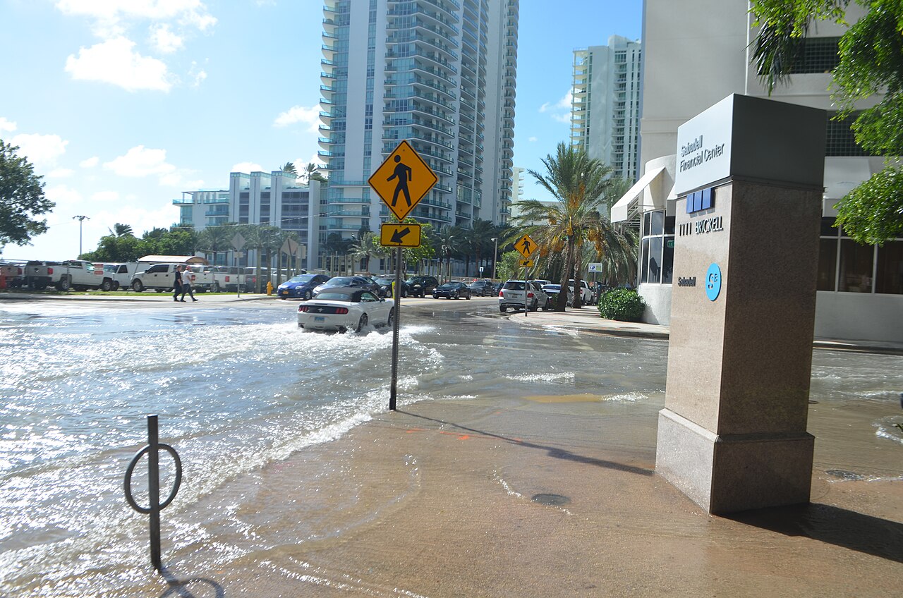
Not that much different to Venice, ain't it?

Last edited by Bofferbrauer2 - on 15 February 2020

Around the Network
numberwang said:
sundin13 said:

It is called "Global Warming" for a reason, and that reason is that different areas may experience temperature change differently, so you need to take Global temperatures into account, and not just temperatures of one area, such as the USA.

If you want to only look at data from 1999 and ignore all the improvements that have been made in our ability to handle the raw data, here is the global temperature data from NASA from 1999:

Improvement to our abilities to handle raw data... I love that expression. :D Just use original data without tempering.

Heatwaves were much more severe in the 1930s with the "Dust Bowl" killing ten thousand. Steinbeck's The Grapes of Wrath is the story of this mega drought.

https://news.google.com/newspapers?id=ueUsAAAAIBAJ&sjid=RCEEAAAAIBAJ&pg=4558,3173079

https://www.nytimes.com/1936/07/07/archives/crop-crisis-worse-heat-rising-to-119-north-dakota-temperatures-set.html

There are numerous reasons you can't just use the raw data. The primary reason is that stations have moved several times. I hope you would agree that comparing data from one place to another place without any adjustment for temperature variations between locations, just wouldn't make sense. Further, there have been changes in the types of thermometers used, the time of day temperature readings are taken and the surroundings of the temperature stations. All of this can further bias the temperature readings if they are not accounted for. Again, I hope you would agree that it would not be wise to simply not account for all of these important variables.

Further, no one disagrees that the US in the 1930s had heat waves, so your clippings are fairly meaningless (and death tolls are even more meaningless, given the massive changes in our ability to prepare for them such as air conditioning and better medical facilities). Again, you have to look at the temperature throughout the year (and not just its hottest points) and across the world (and not just in the place which is experiencing the most severe temperature anomaly). That is cherry picking data.


The lack of basic physics of how the composition of the atmosphere can influence the temperature, never ceases to amaze me. Anyways climate change is a trend which is measurable over long frames. I would say 30 years at minimum. Individual weather records have little to do with them. In the end they are small dots in a graph. All numbers are pointing towards the planet heating up/ changing at an almost unpresented rate.

Natural climate change is pretty much not measurable over the life span of a human. At least if oxygen isotopes, geological data, fossil data etc. is somewhat accurate. At the current projections we can heat the mean global temperature up by almost 3 degrees in onehundred years (and killing large ecosystems like coral reefs with them). By comparison during the last ice age the average global temperature was only 5 degrees lower than before the industrial revolution.

Also for those who doubt the effect of the atmosphere composition on the climate. Venus is way hotter than mercurius. Even though the latter is much closer to the sun. The main difference is the thickness of the atmosphere.


Please excuse my (probally) poor grammar

numberwang said:
SpokenTruth said:

Great.  Now do that for every weather polling station on Earth during the 1930s, average them all up, account for time of day, islanding, etc...and then compare it all to today.

The US has by far the best temperature record on earth

BAHAHAHAHAHAHAHAHAHAHAHA!

Gotta love ironic humour.


I describe myself as a little dose of toxic masculinity.

Jumpin said:
numberwang said:

The US has by far the best temperature record on earth

BAHAHAHAHAHAHAHAHAHAHAHA!

Gotta love ironic humour.

What region has better temp records?

The main problem with the "adjustments" is that it creates a hockey stick temp graph based solely on adjustments, not data. For some reason all temp adjustments are a one way ticket, always cooling the past to increase the "rising trend". What about the opposite, the urban heat effect? Many historic temp stations in urban areas will have an artificial increase by 1-3°F because of growing cities.

The annual mean air temperature of a city with 1 million people or more can be 1.8–5.4°F (1–3°C) warmer than its surroundings. In the evening, the difference can be as high as 22°F (12°C).

https://www.epa.gov/heat-islands

Iceland, Reykjavik, original data. We have the 1930s warm period, followed by the "New Ice Age" and the consequent rebound that capped around the year 2000 (just like the US).

Again "adjusted" to create a hockey stick by cooling old data.

https://data.giss.nasa.gov/cgi-bin/gistemp/show_station.cgi?id=620040300000&dt=1&ds=02

https://data.giss.nasa.gov/cgi-bin/gistemp/show_station.cgi?id=620040300000&dt=1&ds=12


Around the Network
Jumpin said:

I used to believe in global warming. It was clear that the temperature was rising all the way to early August. But then something happened and it has clearly been falling every single month since then, thus disproving science bitches. Sometimes science is a liar!

Best example is the endless "Arctic ice is melting" hysteria every summer just to see the ice return in winter. There is more ice coverage now than at the beginning of this data set in 2006.

No hockey stick here.

ftp://sidads.colorado.edu/DATASETS/NOAA/G02186/masie_4km_allyears_extent_sqkm.csv

Al Gore cashed in at least $100 million from Quatar by selling his news station to the oil magnates. Must be inconvenient to swim in oil money after winning the Nobel Peace price for "fighting global warming".

https://www.bloomberg.com/news/articles/2013-01-04/nobelist-gore-getting-70-million-from-qatar-funded-al-jazeera

(Side note: There was a real decline in Arctic ice coverage from ca. 1980 to 2005 caused by the temp increase/rebound after the "New Ice Age" but it remained stagnant after that)


So your point Wang is that it is all a hoax? Come to Austin, Texas during the summer and enjoy record days above 100F in a row.

Last edited by sethnintendo - on 15 February 2020

numberwang said:
Jumpin said:

Best example is the endless "Arctic ice is melting" hysteria every summer just to see the ice return in winter. There is more ice coverage now than at the beginning of this data set in 2006.

No hockey stick here.

ftp://sidads.colorado.edu/DATASETS/NOAA/G02186/masie_4km_allyears_extent_sqkm.csv

You are literally using the stock argument of climate science denial, lol:

Actual long term data:

But sure buddy, keep picking those cherries and let none fall to the ground.


numberwang said:
Jumpin said:

I used to believe in global warming. It was clear that the temperature was rising all the way to early August. But then something happened and it has clearly been falling every single month since then, thus disproving science bitches. Sometimes science is a liar!

Best example is the endless "Arctic ice is melting" hysteria every summer just to see the ice return in winter. There is more ice coverage now than at the beginning of this data set in 2006.

No hockey stick here.

ftp://sidads.colorado.edu/DATASETS/NOAA/G02186/masie_4km_allyears_extent_sqkm.csv

Gets a chart and doesn't recognize what the data entails. Just great. Also, so nice of you to just get the last years which cuts out the longer term trend.

The size of the ice cover also doesn't say anything about it's thickness. It's cold enough for it to freeze over again, but it's thickness, and thus the amount of water that's gotten frozen again, is diminishing almost every year. About 70% of the sea ice is now 1st year ice, meaning only around 30% of the ice had survived at least one summer.

here, have a look at this: http://polarportal.dk/en/sea-ice-and-icebergs/sea-ice-thickness-and-volume/

Check the monthly case, as it has the same timeframe as your data does, only showing where the ice is - and more crucially, how thick it is. You'll see that over the years, red and yellow (thick ice) make more and more way for green and blue (thinner ice). The result: same area of glaciation, but much thinner ice and thus much less volume. But more on this below.

As you can see, sea ice did go down when you extend the scale a bit further than just to 2006. Especially the minimums in Fall are going down. But how about the volume of the sea ice, not just it's extent?

See how much the volume of ice has gone down even though the area of icing has only shrunk slightly?

http://polarportal.dk/en/sea-ice-and-icebergs/understanding-the-arctic-sea-ice/

http://psc.apl.uw.edu/research/projects/arctic-sea-ice-volume-anomaly/


numberwang said:

The main problem with the "adjustments" is that it creates a hockey stick temp graph based solely on adjustments, not data. For some reason all temp adjustments are a one way ticket, always cooling the past to increase the "rising trend". What about the opposite, the urban heat effect? Many historic temp stations in urban areas will have an artificial increase by 1-3°F because of growing cities.

The annual mean air temperature of a city with 1 million people or more can be 1.8–5.4°F (1–3°C) warmer than its surroundings. In the evening, the difference can be as high as 22°F (12°C).

https://www.epa.gov/heat-islands

Why isn't that valid though? The only reason you seem to be providing is that the adjustments are not valid because they produce results that you do not like. You aren't providing sources stating that the urban heat island effect isn't being accounted for adequately in adjustments.

In actuality, the presence of urban heat islands is one of the reasons why temperatures are often adjusted upwards. Over time, temperature measuring stations have seen a trend of being located in cities, to moving outside of cities, often to airports which don't see the same extent of the urban heat island effect. Because of this movement, the temperatures of these stations either need to be adjusted up, or the original measurements need to be adjusted down which is the exact thing you are complaining about...

Really, the only thing you are saying is that one of the graphs supports your own personal biases, and as such, it must be right, without actually sourcing or proving those claims.

I will also add a sidenote about the fact that most of your "refutations" seem to be based either on the press (such as your newspaper clippings) or on politicians (such as Gore) instead of actually addressing the science directly. Both the press and politicians are pretty terrible at understanding and explaining climate change, so you aren't really doing much to prove that the science is faulty by relying on these sources.