By using this site, you agree to our Privacy Policy and our Terms of Use. Close

Forums - Nintendo Discussion - An irritating detail with Dragons Dogma

So since I live in Sweden I just ordered a US import of the physical copy of this game.

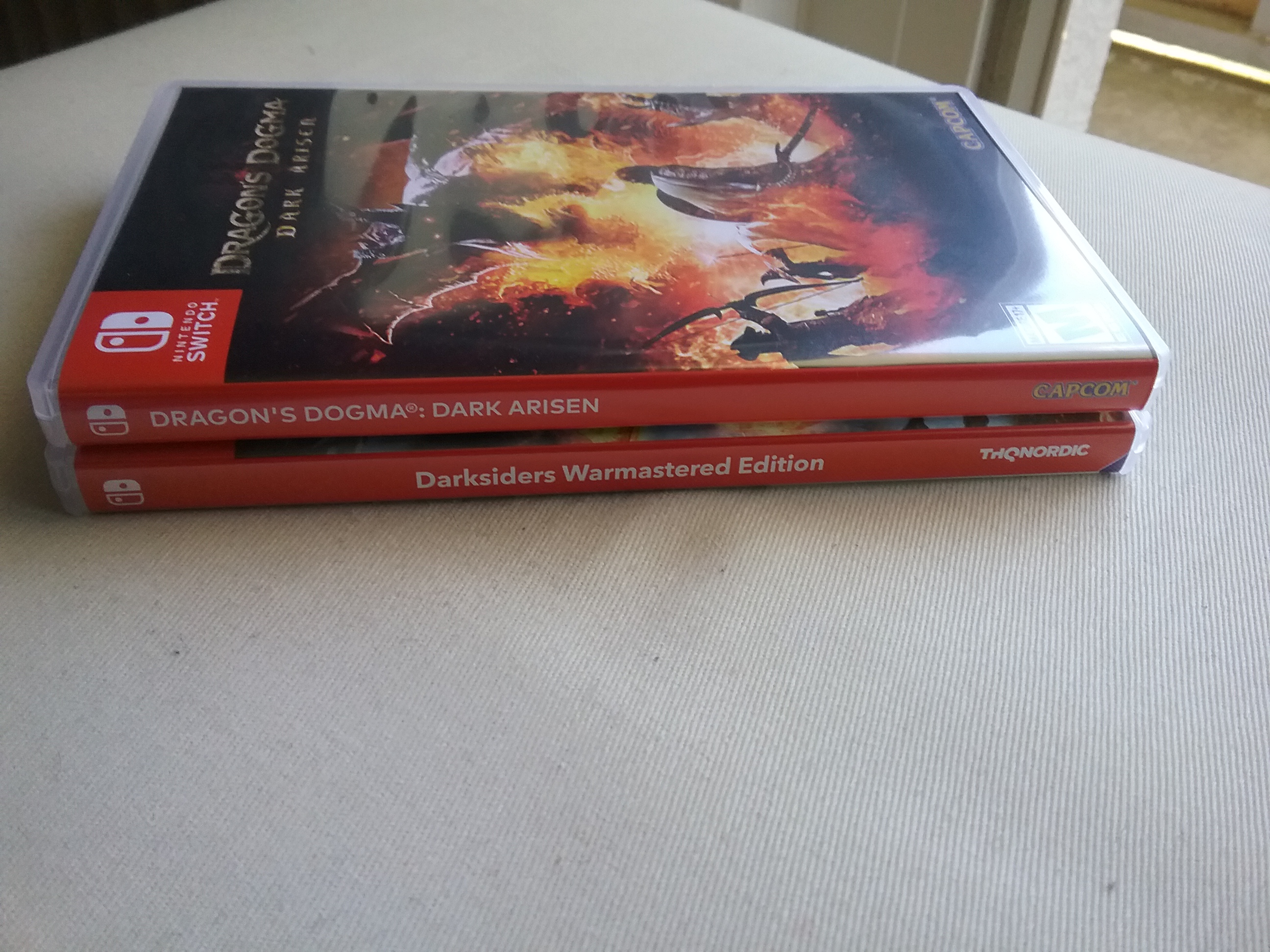
An irritating detail is that the red colour on the spine is a different hue then all my other switch games and the title on the spine isn’t centered (ad it is on all the other games).

Is this a game specific thing, that triggers my OCD, or is it a US vs PAL game thing?

P.S. I’ve not yet played the game 


Around the Network

Is the colour difference really that noticeable? Also, this gives you the chance of making your own box art. I'm sure you can print one according to your preferences.


You know it deserves the GOTY.

Come join The 2018 Obscure Game Monthly Review Thread.

Darwinianevolution said:
Is the colour difference really that noticeable? Also, this gives you the chance of making your own box art. I'm sure you can print one according to your preferences.

To be fair the hue difference isn’t that big but it is noticable at a distance. 

All my other games have a slightly duller red while Dragons Dogma is a more bright red.

I will probably not print a new cover but that damn game sticks out >.<


Now I’ve played a bit and so far I really like the game.

A more serious irritating thing with it is that I wish they would have incorperated motion controlls for aiming with the bow.


I am european too, imported Dragons Dogma too... and I did not notice any color differences, it is too subtle if there. But obviously font and positioning is of the title is different:

But it never bothered me. It is simply I can see which games are from which region.


3DS-FC: 4511-1768-7903 (Mii-Name: Mnementh), Nintendo-Network-ID: Mnementh, Switch: SW-7706-3819-9381 (Mnementh)

my greatest games: 2017, 2018, 2019, 2020, 2021, 2022, 2023

10 years greatest game event!

bets: [peak year] [+], [1], [2], [3], [4]

Around the Network
Hiku said:

Probably hard for people to compare to their US Switch covers unless you post a picture.

It may just be a regional thing though, because I know Nintendo have had different colors for games from different regions before for WiiU.

Mario Kart 8 is apparently red in the US, but in Europe it's light blue.

The first run in the US is light blue as well. Once they started using the red cases for Mario branded games, MK8 got the same treatment. I kinda like the Mario Games standing out. 

Here's something that used to set off my collector OCD:


Retro Tech Select - My Youtube channel. Covers throwback consumer electronics with a focus on "vid'ya games."

Latest Video: Top 12: Best Games on the N64 - Special Features, Episode 7

The sooner you get past your OCD, the better.


Finished it this morning. 50+ hours. IMMEDIATELY began a second playthrough. Yeah, it's flawed but I love this goddam game. And yeah, motion controls would have been nice. Maybe some new clothes, quests, and areas too.


d21lewis said:
Finished it this morning. 50+ hours. IMMEDIATELY began a second playthrough. Yeah, it's flawed but I love this goddam game. And yeah, motion controls would have been nice. Maybe some new clothes, quests, and areas too.

As I said so far I really like it, I have a much better feeling with this than with, for example, Skyrim which was a big dissapointment for me and I never managed finishing.

Since my time is very limited it will probably take a while for me to finish this game tho.