


menx64 on 01 September 2012
It looks bad, I just hope the game is not that bad---
Menx64
3DS code: 1289-8222-7215
NNid: Menx064













It looks bad, I just hope the game is not that bad---
Menx64
3DS code: 1289-8222-7215
NNid: Menx064
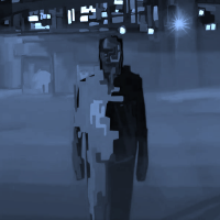


The U.S. version doesn't look any better to me. That zombie's hand doesn't make any sense.

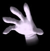



Ewwwww. Icky!
I think Ubisoft's shooting themselves in the foot by making the game seem more campy than the serious hardcore they're going for .
Or do they know something we don't?
Tag (Courtesy of Fkusumot) "If I'm posting in this thread then it's probally a spam thread."



Come on guys, let's make a petition for Ubisoft to change their covers ;)
I'm on Twitter @DanneSandin!
Furthermore, I think VGChartz should add a "Like"-button.



Cant people learn that simpler is better? Just look at the dead island box art. Ugh.
Yay!!!





gumby_trucker said:
I agree it's not very appealing, but it does make sense in the context of the game, just like the game's name makes sense: YOU become a zombie once bitten and then must go back as a new character and fight against yourself as a zombie. |
Interesting interpretation.
I thought the reflection was just a zombie and the eye symbolises you looking straight into a zombies face through the gamepad.


Cobretti2 said:
Interesting interpretation. I thought the reflection was just a zombie and the eye symbolises you looking straight into a zombies face through the gamepad. |
Could be I'm overthinking it, I tend to do that  but for me the game's most compelling feature is that your corpse becomes reanimated when you die. I think it makes for a more persistent experience. Plus it's been something Ubisoft has emphasised in press demonstrations and stuff.
I think they were going for a look that says "this isn't your average Zombie game, and also doesn't take itself completely seriously" but that message is kinda hard to communicate when your brand isn't equated with consistent high quality.
Until you've played it, every game is a system seller!
Wii FC: 4810 9420 3131 7558
MHTri: name=BOo BoO/ID=BZBLEX/region=US
mini-games on consoles, cinematic games on handhelds, what's next? GameBoy IMAX?
Official Member of the Pikmin Fan Club



The American cover is as generic as most American covers.
The European cover was a nice idea badly implemented. The Zombie is just too realistic to be a reflection in the eye.
Any message from Faxanadu is written in good faith but shall neither be binding nor construed as constituting a commitment by Faxanadu except where provided for in a written agreement signed by an authorized representative of Faxanadu. This message is intended for the use of the forum members only.
The views expressed here may be personal and/or offensive and are not necessarily the views of Faxanadu.



The biggest problem I see in the European boxart are the pasted arms on top of the Royal Guard. We've seen the zombie in the old boxart, and now the new attached limbs are in your face. Looks out of place, specially the left arm.

About Us |
Terms of Use |
Privacy Policy |
Advertise |
Staff |
Contact
Display As Desktop
Display As Mobile
© 2006-2026 VGChartz Ltd. All rights reserved.


