
sepoer on 01 July 2012
Well... i hope Nintendo giving us HD remake for WW.


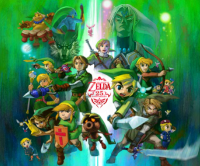


Well... i hope Nintendo giving us HD remake for WW.

| kupomogli said: I disagree as well. For a game that was released last gen, here's a game released last gen that looks better.
|

No. No it does not. Dragon Quest 8 was blocky and filled with redundancy. That doesn't look half as good as Wind Waker even in its bad sections.
That is a nicely positioned screenshot though. You can't see the blurry textures up close, the granulated carboard grass or flowers, the lack of object based lighting and shadows, the complete absence of physics and environmental movement and complete emptiness of the environment as a whole with only half the color diversity. Too bad that isn't how 99% of that game looks when it is actually running in real time.

Wind Waker looked great and had great personality and the art style made the gameplay more interesting as well.
But the lack of land and having to travel by boat I didn't like. Zelda team is not shy about how much they dread having to connect roads together to make the world seemless and the water setting in Wind Waker and Skyward Sword having the flying to destinations thing are both there because they didn't want roads to connect the disparate areas.
That being said, I felt Ocarina of Time and Twilight Princess were better adventure games because you could walk/ride to places.


| Chark said: When this game came out my brother and I were very divided. He borrowed a GameCube to play it, I didn't have an opportunity to play it so I can't say anything about gameplay/story but this isn't about that. I strongly disliked the graphics and to a lesser extent the art. Windwaker is the example of games I choose to example bad cell shading. Cell shading has come a long way since then and has produced some great looking games, but in the early days like with Windwaker, cell shading was void of detail. Colors covered large spaces and touched eachother without pleasant transition with movement. Shadows were ugly, darkening colors flatly on surfaces making it look more like the colors were glitching from dark to light more than actually displaying a shadow effect, atleast when movement was involved. Cell shading looks hundreds of times better today; more detail, better shadow effects, and a wider array of colors. I've played about half of Phantom Hourglass and that game looks better than Windwaker. Early cell shading just looked bad. This is obviously opinion, but if you look at the modern examples of Cell Shading how can you attribute Windwaker as having the best? If anything, its one of the worst. Perhaps your appreciation of the games stems from the game itself, how much fun you had, the story, the world, or even how much you liked the graphics back then. Just because something is new and different doesn't make it better, it helps though. To me Windwaker never looked good, I felt it looked like a blotchy mess of solid color, like playing a game of a children's coloring book with only 3 crayons and half of the lines missing.....ooooh that's a good one, I should have told my brother that back in the day, lol. |
That's what I love about windwaker and makes it look like a hand drawn cartoon. I don't like the gradients and soft shadows of 'evolved' cell shading. The hard transitions is what makes it look great to me. I love the way the shadows play around when you carry a torch into the volcano.
Movement worked fine with this technique and gave it depth where a static screenshot would look like a flat drawing. This play off between a 2D and 3D look gave it its unique feel.

| SvennoJ said:
That's what I love about windwaker and makes it look like a hand drawn cartoon. I don't like the gradients and soft shadows of 'evolved' cell shading. The hard transitions is what makes it look great to me. I love the way the shadows play around when you carry a torch into the volcano. |
I agree. I think it's what they call toon-shading, if I'm not wrong.


it was pretty good, but I never beat it because I lost my memory card
Been away for a bit, but sneaking back in.
Gaming on: PS4, PC, 3DS. Got a Switch! Mainly to play Smash

I get the damnedest thing when I try to play Wind Waker. My eyes burn so much they practically sizzle in my head. I am physically incapable of playing for more than a few minutes at a time. I'm not really a huge fan of the art style beyond that although it is clearly the best looking Zelda game.


Love Wind Waker's graphics. Wish the game itself had a bit more substance to it, but the cel-shaded look is better than anything Nintendo could've done with Twilight Princess and Skyward Sword.
3DS Friend Code: 0645 - 5827 - 5788
WayForward Kickstarter is best kickstarter: http://www.kickstarter.com/projects/1236620800/shantae-half-genie-hero

| F0X said: Love Wind Waker's graphics. Wish the game itself had a bit more substance to it, but the cel-shaded look is better than anything Nintendo could've done with Twilight Princess and Skyward Sword. |
That doesn't make any sense...
About Us |
Terms of Use |
Privacy Policy |
Advertise |
Staff |
Contact
Display As Desktop
Display As Mobile
© 2006-2024 VGChartz Ltd. All rights reserved.
