By using this site, you agree to our Privacy Policy and our Terms of Use. Close

Forums - Sony - Resistance 3 Box Art Revealed!!!

I have to admit: I like how they meshed the buildings on the bottom with the Chimera skull.


Rockstar: Announce Bully 2 already and make gamers proud!

Kojima: Come out with Project S already!

Around the Network
M.U.G.E.N said:
ssj12 said:

so the modified the punisher logo... its cool but not original


lolwut? am I missing something or are you saying this cuz the punisher logo is a skull?


you decide


PC gaming is better than console gaming. Always.     We are Anonymous, We are Legion    Kick-ass interview   Great Flash Series Here    Anime Ratings     Make and Play Please
Amazing discussion about being wrong
Official VGChartz Folding@Home Team #109453
 

It's beeee-eautiful!

Seece posting Playstation news, I mean. The box art is nice, too!


legend92(3) said:

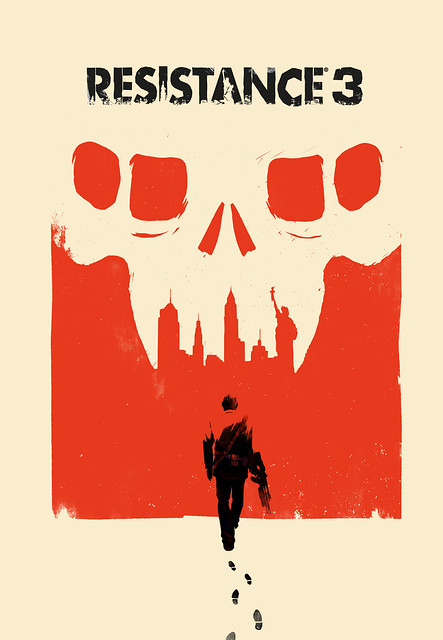
Took me a few looks to notice the teeth are the new york skyline lol


Haha me too! Glad I'm not the only one.

I actually shuddered when I saw this at first. It's kind of plain. But it's really growing on me. The only thing is, they HAVE to go with the one that has Capelli walking toward the chimeran skull. That one is sick, and tells a lot more about the story of Resistance 3 than having just the skull.

Oh, and I can't believe how many people have positive feelings towards this boxart. One of the reasons I shuddered when I first saw it was bc I expected everyone to rip it apart. But there are more positive reactions than negative.


Sure, it's nice, in a minimalist way.

But it's really not that great. Nothing on, say, the European box art for Heavy Rain.

And to be honest, I prefer both of Resistance 2's box arts.


(Former) Lead Moderator and (Eternal) VGC Detective

Around the Network
ssj12 said:
M.U.G.E.N said:
ssj12 said:

so the modified the punisher logo... its cool but not original


lolwut? am I missing something or are you saying this cuz the punisher logo is a skull?


you decide


yeah I'm very familiar with the punisher logo. but it's a skull! lol I mean skulls are in general used a lot. in that sense the punisher logo isn't original either. It's a human skull pirates logo without the crossed bones or something :P I agree in general using skulls is not original, however for a box art for a game? Can't think of many games that looks like this one...or any on the top of my head now :S


In-Kat-We-Trust Brigade!

"This world is Merciless, and it's also very beautiful"

For All News/Info related to the PlayStation Vita, Come and join us in the Official PSV Thread!

i approve of this message


“It appeared that there had even been demonstrations to thank Big Brother for raising the chocolate ration to twenty grams a week. And only yesterday, he reflected, it had been announced that the ration was to be reduced to twenty grams a week. Was it possible that they could swallow that, after only twenty-four hours? Yes, they swallowed it.”

- George Orwell, ‘1984’

makingmusic476 said:

A bit orange for my tastes (loathe that color), but aside from that I really like it.  It reminds me of the Helghan propaganda art from Killzone.

It'd been nice if they could've fit Capelli from the alternate art onto the cover:


This one is much better.


Spectacular cover art ruined by a bunch of useless crap plastered all over it.


oh my god is it bad. Absolutely horrible. Already ruined my anticipation for the game.