By using this site, you agree to our Privacy Policy and our Terms of Use. Close

Forums - Gaming Discussion - Games with the worst art direction

Munkeh111 said:
Lots of you seem to be criticising brown-ness or dreary-ness. What is wrong with that?

Gears was played through abandoned and destroyed cities. It was meant to be dreary as all these great buildings had been ruined by the locust invasion

Helghan is meant to be a horrible toxic place. It should not be bright and happy, it should be grey and miserable

If it's done right, nothing's wrong with it. Games like Resident Evil 4 and Shadow of the Collosus look great despite being dreary and brown/grey.

Killzone 2, however, just looked boring, it was the same dull grey industrial settings over and over again, and it got old fast. The sequel corrected this with stunning landscapes like the alien jungle and the arctic.


Around the Network

Infamous
Gears of War series
Street Fighter 4
KOF XIII
Killzone 1 & 2
Dishonored

EDIT: Forgot to add DMC


I am the Playstation Avenger.
   

Albicant said:
I'd agree with KHlover, realistic looking games (mostly) don't age well at all.

I'll go against the grain with SFIV though, I thought it had a really original art direction. It's one of the rare games where the concept art is actually faithfully translated into the game itself without major discrepancies. I'll admit it took a while to grow on me though.

Agreed with NSMB, it looks horribly bland and plastic compared to the older sprite-based games. More worryingly, Nintendo's applying the same look to the new LttP and Yoshi's Island.

The main problem I have with SFIV is how awkward and nebulous their approach to the graphics looks.

Namco does a better job with semi-realistic graphics in Tekken and Soul Calibur; Marvel 3 looked better because it went super stylized. SFIV's graphics are in some weird region between the two, where it's neither convincingly realistic nor stylized enough. It's just "eh" to me.


Have some time to kill? Read my shitty games blog. http://www.pixlbit.com/blogs/586/gigantor21

:D

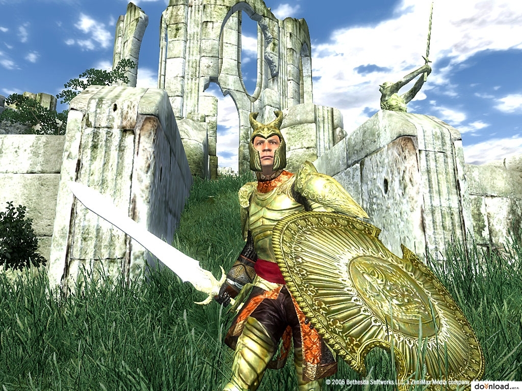
TES IV

The environments were beautiful but repetetive after quite some time. But the characters and npc's looked painfully shitty lol


gigantor21 said:
Albicant said:
I'd agree with KHlover, realistic looking games (mostly) don't age well at all.

I'll go against the grain with SFIV though, I thought it had a really original art direction. It's one of the rare games where the concept art is actually faithfully translated into the game itself without major discrepancies. I'll admit it took a while to grow on me though.

Agreed with NSMB, it looks horribly bland and plastic compared to the older sprite-based games. More worryingly, Nintendo's applying the same look to the new LttP and Yoshi's Island.

The main problem I have with SFIV is how awkward and nebulous their approach to the graphics looks.

Namco does a better job with semi-realistic graphics in Tekken and Soul Calibur; Marvel 3 looked better because it went super stylized. SFIV's graphics are in some weird region between the two, where it's neither convincingly realistic nor stylized enough. It's just "eh" to me.

100% agree. It honestly looks like claymation charicatures of Street Fighter characters. Have you seen how huge Chun Li's hands are? I hope they go the route of MVC3 in SF5. Or maybe the art style they used in SF3, but with 3d models.


I am the Playstation Avenger.


Around the Network

Borderlands. I hate it.


The whole Gears of War series.


gigantor21 said:
Albicant said:
I'd agree with KHlover, realistic looking games (mostly) don't age well at all.

I'll go against the grain with SFIV though, I thought it had a really original art direction. It's one of the rare games where the concept art is actually faithfully translated into the game itself without major discrepancies. I'll admit it took a while to grow on me though.

Agreed with NSMB, it looks horribly bland and plastic compared to the older sprite-based games. More worryingly, Nintendo's applying the same look to the new LttP and Yoshi's Island.

The main problem I have with SFIV is how awkward and nebulous their approach to the graphics looks.

Namco does a better job with semi-realistic graphics in Tekken and Soul Calibur; Marvel 3 looked better because it went super stylized. SFIV's graphics are in some weird region between the two, where it's neither convincingly realistic nor stylized enough. It's just "eh" to me.

Can definitely see where you're coming from; it's a bit of a love/hate style. The thick black calligraphy style that comes out with focus attacks etc won me over, there isn't really another game that looks like it.

I'm not sure if they should keep the style if they make SFV though.


People don't like Cel-shading?? I just can't understand that


Games can and should tell stories and share ideas through their mechanics. This is the intrinsic element of the medium and this is how experiences should be crafted in video games. No company does this as well as Nintendo and their echoes from the past.
  Aurum Ring  Delano7  Ocarinahero032

The only games where I have been constantly aware of how bad they look are the InFamous games (sorry fans).


No troll is too much for me to handle. I rehabilitate trolls, I train people. I am the Troll Whisperer.