By using this site, you agree to our Privacy Policy and our Terms of Use. Close

Forums - Gaming Discussion - Games with the worst art direction

The art direction they went with The Darkness 2. The blood, gore and violence all turn comical. Plus it made every one in the game looked ugly has hell.


Bet with gooch_destroyer, he wins if FFX and FFX-2 will be at $40 each for the vita. I win if it dont

Sign up if you want to see God Eater 2 get localized!! https://www.change.org/petitions/shift-inc-bring-god-eater-2-to-north-america-2#share

Around the Network

For me:


Pretty much any game aiming for a realistic look that released more than 5 years ago. They all aged terrible.


I'd agree with KHlover, realistic looking games (mostly) don't age well at all.

I'll go against the grain with SFIV though, I thought it had a really original art direction. It's one of the rare games where the concept art is actually faithfully translated into the game itself without major discrepancies. I'll admit it took a while to grow on me though.

Agreed with NSMB, it looks horribly bland and plastic compared to the older sprite-based games. More worryingly, Nintendo's applying the same look to the new LttP and Yoshi's Island.


Mortal combat


Around the Network
KHlover said:
Pretty much any game aiming for a realistic look that released more than 5 years ago. They all aged terrible.

Remember when people thought this was good?

(Eternal Darkness)

When devs finally realized that those green lights looked like shit? They were quite common back then:

(Primal)

(BloodRayne) I know she's using a vampiric power, but why green? he looks like an army men!


JayWood2010 said:

what this thread is going to be is people taking popular games that they dont like and saying they have a horrible art direction. As seen with the first few comments. This is very opinionated.


Yes. That is the very purpose of this thread.

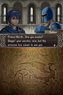
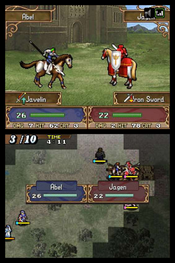
By far, there's only one game I've never beat (Or will keep playing it) because of its putrid art style direction:


Not only the art direction, but also one of the most mediocre entries in the Fire Emblem franchise.


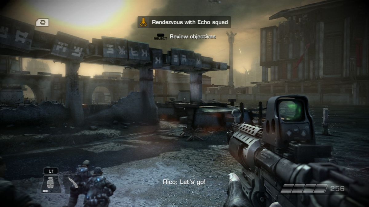
Lots of you seem to be criticising brown-ness or dreary-ness. What is wrong with that?

Gears was played through abandoned and destroyed cities. It was meant to be dreary as all these great buildings had been ruined by the locust invasion

Helghan is meant to be a horrible toxic place. It should not be bright and happy, it should be grey and miserable


Munkeh111 said:
Lots of you seem to be criticising brown-ness or dreary-ness. What is wrong with that?

Gears was played through abandoned and destroyed cities. It was meant to be dreary as all these great buildings had been ruined by the locust invasion

Helghan is meant to be a horrible toxic place. It should not be bright and happy, it should be grey and miserable


Just because an art design is appropriate for its setting, that doesn't prevent it from being unappealing. It could be the case that people hate the setting and the art design. I guess it depends on what you mean when you say "worst."