


By using this site, you agree to our Privacy Policy and our Terms of Use. Close

Forums - Gaming - The Best and Worst of Video Game Box Art

Zkuq said:
SanAndreasX said:

This was an interesting choice.

Very minimalist, but it also showed off just how powerful PS1-era Square really was in Japan. They didn't need a bunch of elaborate box art. They could sell this game with just a logo on the white background. But at the same time, it was also clean and elegant, an opposite number of the often garish covers of the time.

It was the same in Europe until XIII, which took a turn to a less minimalistic direction, and finally XV threw it out of the window entirely. I think X has my favourite box art of the series due to its colours and the balanced size of the imagery. XII already had quite large imagery. VI is another one whose art I personally like, probably due to the selected colours, but objectively I'd say it's worse that X's.

Anyway, here's X's European box art:

In the US, it was the opposite for the SNES games.

These were very minimalst. I suppose Square USA didn't want to spend a lot of money printing them, plus there was also the American aversion to anything that looked "foreign." Square USA actually tried to play up Mog as a mascot for FFIII (FF6). The US TV commercial was done in claymation and featured Mog holding "auditions" for monsters only to zap them with lightning.

In Japan, the Famicom FF1-3 featured Amano artwork. FF4-5 on the SFC, however, featured renditions of the chibi sprites for some reason.

FF6 once again got a full Amano illustration in Japan, similar to the FC games.


Around the Network
SanAndreasX said:
Zkuq said:

It was the same in Europe until XIII, which took a turn to a less minimalistic direction, and finally XV threw it out of the window entirely. I think X has my favourite box art of the series due to its colours and the balanced size of the imagery. XII already had quite large imagery. VI is another one whose art I personally like, probably due to the selected colours, but objectively I'd say it's worse that X's.

Anyway, here's X's European box art:

In the US, it was the opposite for the SNES games.

These were very minimalst. I suppose Square USA didn't want to spend a lot of money printing them, plus there was also the American aversion to anything that looked "foreign." Square USA actually tried to play up Mog as a mascot for FFIII (FF6). The US TV commercial was done in claymation and featured Mog holding "auditions" for monsters only to zap them with lightning.

In Japan, the Famicom FF1-3 featured Amano artwork. FF4-5 on the SFC, however, featured renditions of the chibi sprites for some reason.

FF6 once again got a full Amano illustration in Japan, similar to the FC games.

That's an interesting history splash, so thanks! Also, those Japanese box arts you posted are pretty cool, even if they're not as minimalistic as during the PS1 and PS2 days. Those American box arts you posted though... I've always hated them, ugh. Not classy at all! At least the one for 'III' has something going on, but the one for 'II' looks really cheap. Somehow they've done minimastic both correctly and poorly along the years.


This is cheating a bit, but I was tidying out my cupboards today and found the custom box my Dad made me for Kirby's Ghost Trap in 1998.

He used to called the Super Nintendo the "Stupid Nintendo" as a joke. He passed in 2008 so this is something I treasure.


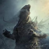
This was a rather notorious one. Not only did it have the huge ratings blurb on the front cover, but this was scanned directly from IGN and has the IGN watermark on it. It caused so much uproar that Capcom let players send their watermarked covers in for a replacement.


archbrix said:

Probably the cheesiest NES art I can think of:

They tried to replicate that cheesiness with the Megaman 9 Boxart:

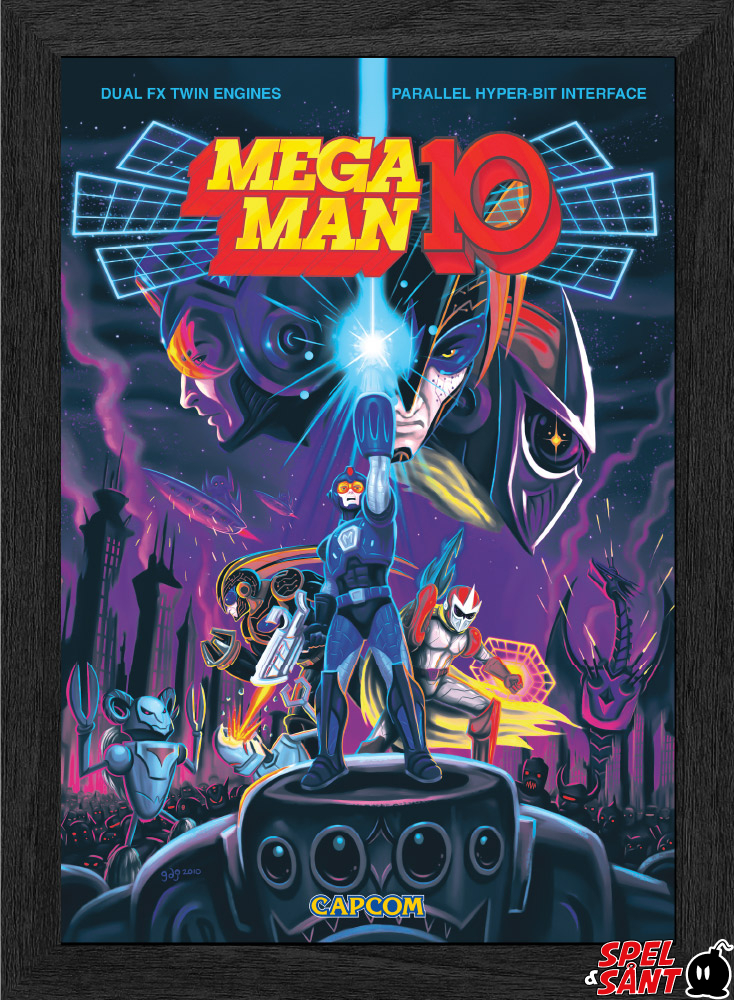
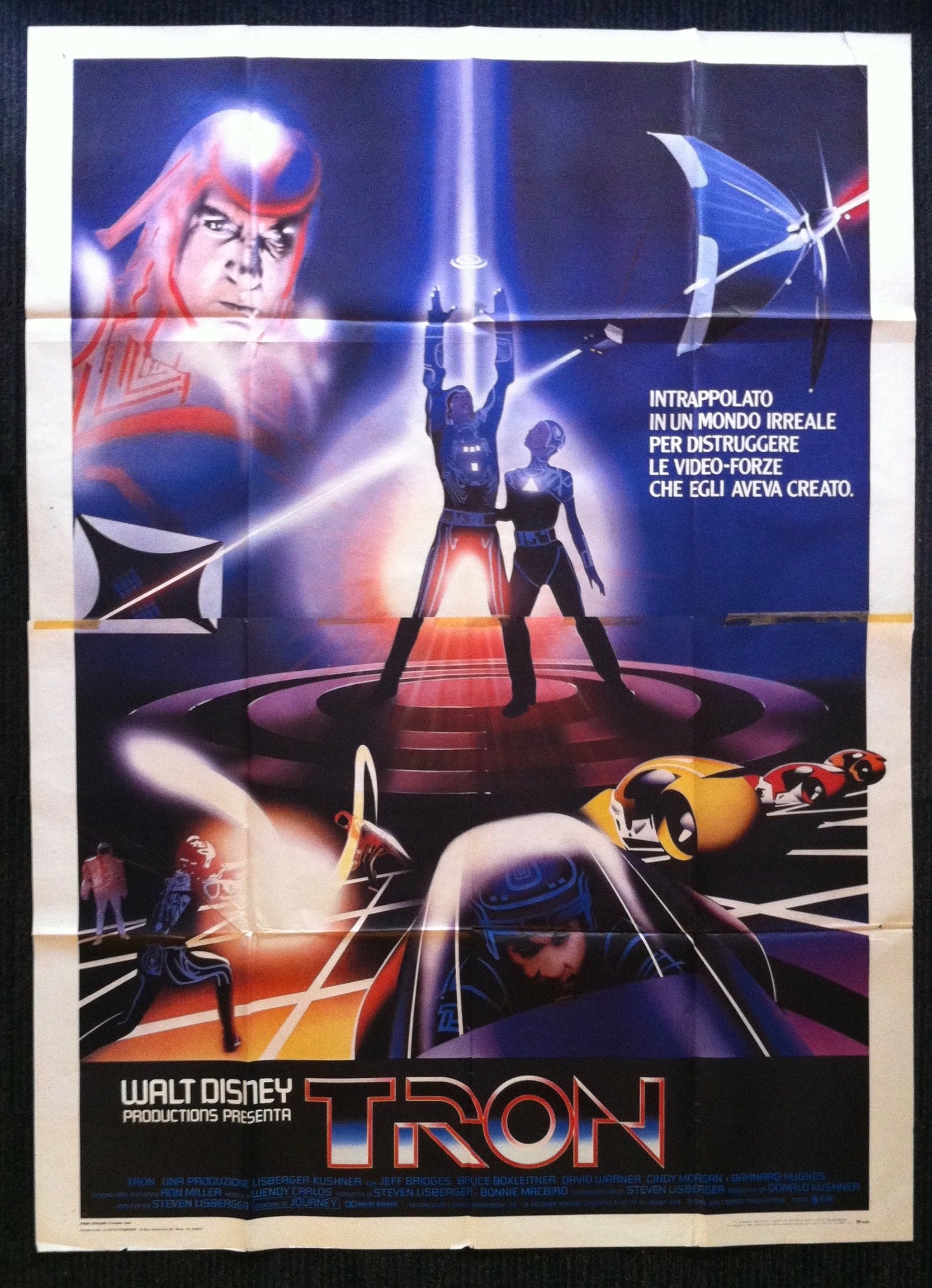
Megaman 10 somehow reminds me more of the original Tron poster:


Around the Network
SanAndreasX said:

This was a rather notorious one. Not only did it have the huge ratings blurb on the front cover, but this was scanned directly from IGN and has the IGN watermark on it. It caused so much uproar that Capcom let players send their watermarked covers in for a replacement.

They made a balls up with the watermark etc, but the actual art itself is really good.


I just recently seen the Japanese boxart for Lost Odyssey and I have to say, it's beautiful 


drbunnig said:
SanAndreasX said:

This was a rather notorious one. Not only did it have the huge ratings blurb on the front cover, but this was scanned directly from IGN and has the IGN watermark on it. It caused so much uproar that Capcom let players send their watermarked covers in for a replacement.

They made a balls up with the watermark etc, but the actual art itself is really good.

Sadly, the cover art fiasco was kind of an omen for Capcom's eventual decline and the decisions they made that got them a lot of bad press. They really struggled during most of 7th gen. At the same time GTA V was releasing, the gaming media was putting out headlines saying that Capcom was basically broke. Their turnaround in the subsequent years was nothing short of breathtaking.  


Bentley on the NTSC cover of Spyro 3.

Bentley on the PAL cover of Spyro 3.