OTBWY on 28 July 2018
Ok, this thing should be settled right now. No messing around.
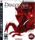
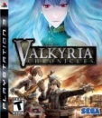
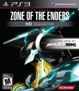
Which one has the best cover art out of these:
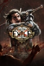
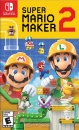
NA cover: 
EU cover:
You decide. Also be sure to state your reasons on which one you chose.