Acevil on 13 January 2017
Turkish said:
Are these the same format as PSP cases? Would be cool and a nice hommage from Nintendo!
|
You mean similar to the gamecube Japan right?


Turkish said:
Are these the same format as PSP cases? Would be cool and a nice hommage from Nintendo!
|
You mean similar to the gamecube Japan right?

Acevil said:
You mean similar to the gamecube Japan right? |
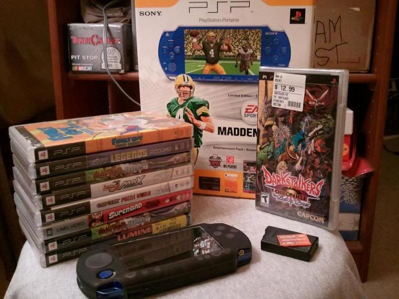
Looks way more like the PSP ones.
KLXVER said:
Looks way more like the PSP ones. |
Looks no different to me, at least size wise, which is that it isn't homage to the PSP as much as you can say it is themselve.


Holy shit those are nice! Maybe the nicest I've seen, actually. Most cases are either "ugly" or "not ugly," but these ones look legitimately great to me.

The grey with the red is very nice and logo is small and clean. I like it. I will miss the blue but Red makes more sense for Nintendo.

I like it, nice and compact. Curious about those end labels though, will they all be red?

And of course Europe gets different box arts that look ugly as fuck... sigh. Why?
"The strong do what they can and the weak suffer what they must" - Thoukydides


Size matters talking about boxes.... that's why Switch is a home console!
Switch!!!
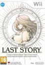
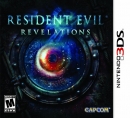
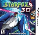
Heres a comparison between various boxes. Its obvious the Switch comes from the style of japanese GameCube and SuperFamicon, top and right of PSP respectively.

The label is in the style of the SF and gamecube. The PSP label and style is more traditional, like the Playstation 2 onward.
“Simple minds have always confused great honesty with great rudeness.” - Sherlock Holmes, Elementary (2013).
"Did you guys expected some actual rational fact-based reasoning? ...you should already know I'm all about BS and fraudulence." - FunFan, VGchartz (2016)
About Us |
Terms of Use |
Privacy Policy |
Advertise |
Staff |
Contact
Display As Desktop
Display As Mobile
© 2006-2026 VGChartz Ltd. All rights reserved.