
JRPGfan on 05 March 2016
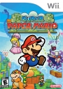
Its beautifull.... this is why we ve been missing paper mario.
But theres just no way around the gameplay, which in a game is much more important than graphics.


Its beautifull.... this is why we ve been missing paper mario.
But theres just no way around the gameplay, which in a game is much more important than graphics.

| Versus_Evil said: It looks great and fun to play and isn't that the point? aren't games supposed to be.. fun?. the Overreaction is so silly. |
Or you just aren't seeing what everyone else is. The denial is so silly.


Does anyone think that this game will utilize the Splatoon amiibos in some way?


It looks pretty, but I don't buy games to stare at them.

---Member of the official Squeezol Fanclub---


It looks really pretty, yeah, I'm just very worried about the gameplay... But it certainly looks pretty.
| Versus_Evil said:
Please enlighten me as to how I'm in denial? I would love to know Mr. |
I didn't necessarily say you were, that was more aimed at that those saying it isn't like Sticker Star or we don't have enough info to say if it is. I mean there are some (not on this site) that are so adamant that there will still be partners in this game.
Actually I think it looks underwhelming. Nothing about the graphics scream HD or Wii U game. I guess there is not much room for improvement with the paper aesthetic.
Compare it with 3D world or Captain Toad for instance and it just looks flat (for lack of a better word)
http://www.youtube.com/watch?v=F1gWECYYOSo
Please Watch/Share this video so it gets shown in Hollywood.
| Einsam_Delphin said: I didn't necessarily say you were, that was more aimed at that those saying it isn't like Sticker Star or we don't have enough info to say if it is. I mean there are some (not on this site) that are so adamant that there will still be partners in this game. |
D'oh! XDDDD. I really think you are going to be right about this game. Which is a pitty, this franchise has a lot of potential. In the end, if everything's going on this path, we really have to talk with our wallets. It's the only think that will really work.
I was kind of underwhelmed to by the visuals to be honest. I think they could have gone much further with both, the paper and cardbox craft aesthetic and the concept of the lost color.
Just compare it to the obvious care that went into Yoshis Woolly world. That title got everything right about it's visuals, from how the materials bended under Yoshis feet, to his little fuzz glow. This just looks...sort of phoned in by comparison, honestly.
Take those barrels in the backround for example, nothing about them suggests to me that they are made out of paper. They could be an asset in pretty much any low poly cell shaded game.
There is no such attention to detail as ripped paper with fuzzy ends, or even significantly diffrent paper strucktures.
From Origami techniques over diffrent surfaces for diffrent sorts of paper to the lightning of the game, there is so much more they could have done from a visual design standpoint.
This should sort of look like a set build by someone and lit by flashlights and table lamps, imo.
Also, the crisis in lost color can't be very bad if I had to look twice in the initial footage to even spot the colorless things. Make the world papercolored (And yes diffrent papers have diffrent colors ranging from white, over grey to yellowish, so with good lightning there would be no trouble distinguishing things) and let the contrast of the returned color be that much more impactful.
I also feel like the color palette clashes pretty badly in some instances. That shade of magenta red in the second screenshot looks awful next to a bright spring green, for example. Someone here decribed it as pastel, but most of those colors are bright primary colors. I think the flatness that the colors have regardless, is down to bad lighting and underuse of strucktures.
It looks really great. Even the haters have to admit that!
About Us |
Terms of Use |
Privacy Policy |
Advertise |
Staff |
Contact
Display As Desktop
Display As Mobile
© 2006-2026 VGChartz Ltd. All rights reserved.
