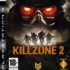
First one - Awesome, subtle but awesome. I think it'll grab peoples attention (how many predominantly white covers do you see these days)
Second one - Tried and true formula, not exactly a bad thing, but it hardly shouts "i'm original, buy me!", but then again it's more in line with the adhering to all FPS conventions this games doing (yeah, cheap shot at KZ2, but that's what I'm feeling from the cover). Not a bad cover at all though.
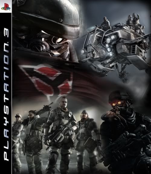
3rd one - Looks like amateur hour to me, very crappy. Biggest problem I have with it is that the transition between pics looks like crap. From top left hand corner going right then down: Black, White, Black, White. I know they're going for symmetry here (good vs bad), but it's just too obvious and poorly done.
No title is a no-no aswell, but if they had the title, and the helghast on the left and the "good guys" (forgot their faction name) on the right, that would have been different but much more cohesive.