By using this site, you agree to our Privacy Policy and our Terms of Use. Close

Forums - Nintendo - Gen 1 had the worst Pokémon, in my opinion

Every Generation has some Pokemon that are really well designed and some that are really boring.

That being said, I have to disagree with you, I really like the rather simplistic but very expressiv gen 1 design a lot.
All 3 starter Pokemon are awesome and you have classics like Machamp, Alakazam, Gengar, Scyther, Gyarados, Eevee, Mew, Mewtwo and c'mon dude Golem and Onix are easily the best rock typ pokemon.

If I have to make a list it would be:
1. gen1
2. gen4
3. gen3 and gen7 can't choose one over the other
5. gen2
6. gen6
7.gen 5

Last edited by MrWayne - on 20 May 2018

Around the Network

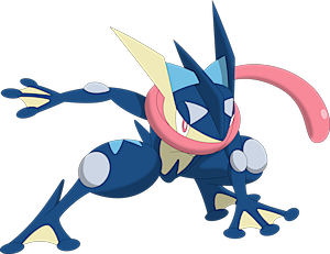
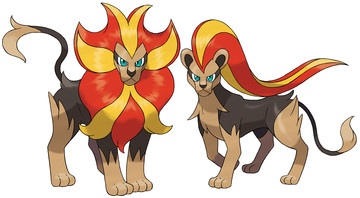
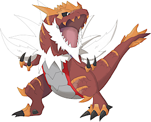
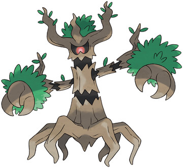
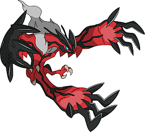
The gen 6ers are so damn underrated it's tragic. The Froakie line, Fletchling line, Pancham line, Litleo line, Honedge line, Inkay line, Skrelp line, Helioptile line, Tyrunt lint, Amaura line, Phantump line, Noibat line, Fennekin, Braixan, Chespin, Meowstic, Sylveon, Hawlucha, Xerneas, Yveltal, Hoopa, and Volcanian designs are all out of this world and some of their best ever. The only bad designs are Klefki, the Spritzee line, and Swirlix line for a grand total of 5 bad ones. I feel like because a lot of people thought the Gen 6 games themselves were underwhelming the incredible designs from that gen get way overlooked.


I don't know man, the following are all worse for me:
- the garbage pokemon
- the ice cream
- the sword
- the keys
- the heart fish

I'm sure I forgot some.


I'd have to wholeheartedly disagree and I'm not even a genwunner and my first game was DP. The pokemon today don't look stylish at all, it's very abstract, lacks personality. There are a few that do end up standing out, but as a whole, the further it seems to get, the worse the designs seem to get. Ken Sugimori was the best Pokemon designer by far imo and to me, captures the spirit of what the series originally was. It was inspired by his own encounters, just personified and it shows. And that bridge between reality and fantasy was so sublime and pure in the Gen 1 designs and Gen 1 in general.

To me, design wise, and personality wise, Gen 5 had the worst pokemon designs, followed by Gen 6. With Gen 3 imo being the best, follwed by 1, and then 2. But that's what opinions are all about, as long as you aren't objectively trying to force your point, it's fair game. And beauty is in the eye of the beholder. Just for me, the original designs are so distinct and unique, especially for their time.

Last edited by Ljink96 - on 20 May 2018

theprof00 said:
You say that you're being objective because you're not affected by the nostalgia of gen 1 players.... but really you're just being affected by your own nostalgia of the gens you grew up on.

I'm not being objective. It's impossible to be objective with such a subjective topic as creature design. I grew up playing Gen 3 and 4. Most of my favourite Pokémon are from Gen 6, and I didn't even play X and Y that much.

theprof00 said:
Look, as an objective opinion, gen 1 was really conservative with their designs.

There's no such thing as an objective opinion. If it's objective, then it's not an opinion. But yeah, they were conservative with the designs. Probably because of hardware limitations, tbh.

theprof00 said: 
They used iconic animals and insects and just made them into poke.

And magnets. And piles of mud. And fighting-styles. And eggs. And clouds of gas. And pokéballs. And purple blobs. And rocks.

theprof00 said: 
As someone who played gen 1 at launch, what I noticed specifically was that as the gens continued, it seemed like there was less focus on making a clever name and clever design, and more of a focus on "cool".

Yeah, because Gen 1's names and designs were really clever.

Some great names, for example: Ekans = Snake backwards; Arbok = Kobra backwards; Seel = Seal; Dewgong = Dugong; Muk = Muck; Mr. Mime; Abra, Kadabra, Alakazam; Golem = Golem; Koffing = Coughing; Krabby (literally called Crab in Japanese);

For names, they usually just took two words in English in their entireties and put them together without altering anything (or altering very little): Beedrill = Bee + Drill; Sandslash = Sand + Slash; Bellsprout = Bell + Sprout; Ninetales = Nine + Tails; Venomoth = Venom + Moth; Horsea = Horse + Sea, etc.

Nowadays, they try to get more meanings and words (a lot in different languages) in a name to make it sound original. Decidueye, for example, is the combination of deciduous, duel and bullseye. Primarina is the combination of prima donna, marina and ballerina, etc.

And "clever designs"? Krabby is a literal crab. Ekans is just a snake. Venomoth is just a moth. Diglett is a capsule with three circles as two eyes and a nose. Dugtrio is just three Digletts slapped together. Poliwag is a regular tadpole. Geodude is a rock with a face and arms. Seel is just a seal. Dewgong is just a dugong. Grimer and Muk are piles of goo with faces. Gastly is a ball of gas with a face. Electrode is just Voltorb upside down. Goldeen is just a goldfish, etc. There are some clever designs, such as Eevee and Slowpoke, but they are few.

It's not clever to just get a random animal or object and call it a Pokémon. Nowadays they seem to try and incorporate cultural aspects and interesting creatures from around the world to make it look more unique. That's clever.

By the way, there's a Pokémon called Tentacool in Gen 1. They were trying to be cool.

theprof00 said: 
Additionally, newer pokemon have this kind of human quality and facial expressions that most of us didn't really like from the gen 1 types that did.

I'd like examples, because I don't see that.

theprof00 said: 
I'd say if you really want to understand the difference between the gens, just look at what seems to make gen 1 look more like actual animals or things, and what makes later gens seem more like cartoon characters. Later gens just kind of feel like they have "accessories" or "flair", yaknow like they thought they were too bland or something. They just feel kind of overdone.

I think it's great that they look more like "cartoon characters". Having "accessories" or "flair" is not necessarily a bad thing. While there are some overdone Pokémon for sure, such as Vanilluxe, most detailed Pokémon actually look very good. One of my favourites is Aurorus.

It's a very detailed Pokémon, and it has "accessories". But they're all justified, and they all come together to form a cohesive, beautiful creature. Its body shape resembles an Amargasaurus, its main inspiration. Its colourful sails are based on aurorae, the gems on its body represent the Rock-type and its colours represent the Ice-type.


Around the Network
Ka-pi96 said:
Angelus said:
It was simplistic design, sure enough, but at least everything was easily identifiable in terms of what's what. When one looks at the pokemon from the newer generations, if you haven't played them, you'd have no idea what falls into what type with most of them. Especially since practically everything falls into multiple categories now.

The old design philosophy was smart, even if it was quite basic.

I'd argue that's a good thing. The colour coding based on type was a stupid idea to being with. That said, they might still be doing that, haven't played gen 7 and barely played 6, but I hope they're not doing it anymore.

Well this is a rock/poison type so, not really as much;


Green098 said:

Well this is a rock/poison type so, not really as much;

Wait...I didn't know the loli pokémon was rock/poison wtf

Last edited by Keybladewielder - on 20 May 2018

Kaneman! said:
I don't know man, the following are all worse for me:
- the garbage pokemon
- the ice cream
- the sword
- the keys
- the heart fish

I'm sure I forgot some.

I don't see why a garbage pokémon would be any worse than a sludge pokémon. I don't see why an ice cream pokémon would be any worse than an egg pokémon. I don't see why a possessed sword would be any worse than a living pokéball (not even a possessed pokéball, just a pokéball that somehow lives). I don't see why a keychain pokémon would be any worse than a magnet pokémon. I don't see why a heart fish pokémon would be any worse than a regular crab.


All this gen 6 bashing sucks! How can anyone love this franchise and not think these are amazing designs:


Green098 said:
Ka-pi96 said:

I'd argue that's a good thing. The colour coding based on type was a stupid idea to being with. That said, they might still be doing that, haven't played gen 7 and barely played 6, but I hope they're not doing it anymore.

Well this is a rock/poison type so, not really as much;

It's an Ultra Beast. While I don't like the concept, they're supposed to be weird, because they're from outer space. That's why it looks nothing like what its type would suggest.