OttoniBastos on 20 November 2016
.
Last edited by OttoniBastos - on 03 July 2018


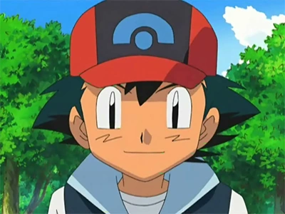
Do you like Ash`s new look? | |||
| Yes | 15 | 15.79% | |
| No | 54 | 56.84% | |
| Pikachu! | 26 | 27.37% | |
| Total: | 95 | ||
.
Last edited by OttoniBastos - on 03 July 2018
Xxain said:
Hahahahaha. That actually appeared in the show? Hahahahaha |
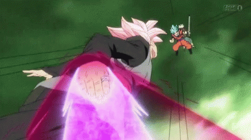
It´s actually a great animation sequence, one of the best in the series. The change in style bothers a lot of people though
- Our album on spotify https://open.spotify.com/album/56mEbEgyBYGzcDyZ1eMQ1v?si=hYKgir5YRSCrzywgGmV4oQ
- Our videoclip
- My manga: https://www.webtoons.com/en/challenge/blanca-the-world/list?title_no=313068
Hiku said:
It's not just about the stills. I posted the animations as well. Those are the ones I am focusing on.
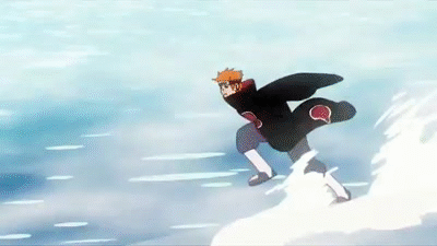
That Pain fight was a pointless filler sequence (none of that fight was in the manga) that was supposed to be a big moment in the Naruto series. You can clearly make amazing animation without compromising the artstyle to an unfathomable degree, when you have the budget of some of these top animes. So I'm not going to make excuses for that travesty. |
- Naruto vs Pain is done way better than those 2 first DBS segments.
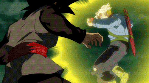
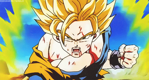
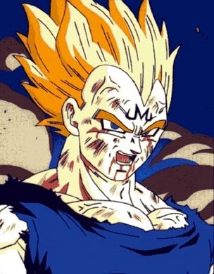
- DBS has worst average animation than Z, but the best ones (last video or last episode with Vegito) are better than Z's best. What's gotten worst is drawing quality. I actually think some of the times it's the same guy but he just got worst at drawing when compared to 90's DBZ which personally I think it's the best for the series
- Our album on spotify https://open.spotify.com/album/56mEbEgyBYGzcDyZ1eMQ1v?si=hYKgir5YRSCrzywgGmV4oQ
- Our videoclip
- My manga: https://www.webtoons.com/en/challenge/blanca-the-world/list?title_no=313068
Oh, and while Dragon Ball and Naruto have bigger budgets, they also have very tight release schedules. They have to outsource to other studios and animators have to draw quickly to achieve those schedules, obviously affecting the quality of drawings. Of course, at their best it's hard for other anime's to top them.
And the final Naruto vs Sasuke fight also had a lot of filler sequences. You have to do them or else fights wouldn't have as much fluidity or would be just too short. You can see in Naruto best animations that most of the taijutsu they engage in it's not "canon", but it adds a lot.
OT. I much prefer this Ash to the last one, comenting on animation is another thing, but at least the design is better. I prefered the original one, but I hated the Kalos design, looked like a cheap attempt to make it a more mainstream anime design
- Our album on spotify https://open.spotify.com/album/56mEbEgyBYGzcDyZ1eMQ1v?si=hYKgir5YRSCrzywgGmV4oQ
- Our videoclip
- My manga: https://www.webtoons.com/en/challenge/blanca-the-world/list?title_no=313068
| Hiku said: 1.) You're entitled to your opinion of course. And if you like it then you may not understand why others hate it. But the fact that the Naruto vs Pain sequences is notoriously hated and laughed at, while DBS episode57 recieved unanimous high praise 2.) I agree. And DBS has a whole slew of different animators for each episode. And they change lead animators from episode to episode.
They sure do, but the studios can save their ammo for for the big important fights. Toei handled this very well in the Future Trunks arc. (Not so much in the previous ones, except for Goku vs Hit.) The Pain vs Naruto fight was supposed to be an epic intense moment. But it makes a lot of people angry, or laugh, because of the direction they chose. |
1) I can completely understand why a lot of people hate that fight in the anime. Powers were not consistent with what was shown either in the manga or anime, style changed and wasn't what most anime viewers are used to. But the reasons it is hated don't have much relation to the quality of the work shown in the episode in regards to animation, this is like playing experimental jazz or progmetal in a regular envoirment and people would say it's just "noise". Reffering only to animation, I doubt anyone who has studied or animates would tell you that episode 167 of Naruto sucks, I would advise anyone who is interested in animation to watch that episode actually. So I doubt the consensus disagrees with me, at least in animator's circles.
These guys do a better job than me explaining it and you can also see that the animators behind that episodes are some of the best in the entire industry by checking where they have worked before. Check out Norio Matsumoto for example has awesome work in Naruto, 99' Hunter x Hunter and Rurouni Kenshin.
https://www.youtube.com/watch?v=bNfMoLtTbmA
On the Dragon Ball clips, there is a sequence in that episode that is pure brilliance (I think it was the third one you posted) and that sequence is the one that is highly praised everywhere. But the first 2 clips you posted use a lot of limited animation, it's good and acceptable (It would be impossible to have the whole episode looking like those 40 seconds of brilliance) but it's not top notch or the scenes people praise.
Also, this has more to do with style, but Naruto and DBZ have different styles which influence what we usually see when animating them. Naruto uses a style that took a lot from Neon Genesis Evangelion, character models have more plasticity and can be deformed easily to get fluid movement (can be seen in good sakuga moments in series like the 99 Hunter x Hunter). DBZ doesn't look so good when you do that, but you can see they started trying in Super like in fights between Goku and Bills (not the one that sucks haha, the good clips from the best fight) but they didn't do it in great fights of the old series like Goku vs Buu, Goku vs Vegeta or Gohan SSJ2 vs Cell Jr.
2) What I meant with filler movements being neccesary is that if you only animated what's in the manga, you would have fights that last for 2 punches or 3 kicks, etc... It's part of the medium chosen, anime and manga are different. If the filler is awkward then that's another thing (I understand why people don't like this episode).
3) I think my favorite DBZ art comes from the final part of the Z series

- Our album on spotify https://open.spotify.com/album/56mEbEgyBYGzcDyZ1eMQ1v?si=hYKgir5YRSCrzywgGmV4oQ
- Our videoclip
- My manga: https://www.webtoons.com/en/challenge/blanca-the-world/list?title_no=313068
People are really comparing Dragon Ball Super and Pokemon ? I'm sure that, despite the change of art style, Pokemon won't become worse than Super's animation.


Just to add to my previous post. Dragon Ball Super's animation is very bad 95% of the time. In the episode 66, the final episode off the future's arc, Vegeto's energy sword looked like a static Image.
Oh, and for the OP, there is no need for explanation. It's a new art style. Everyone looks different.
And there's a technical reason for the change in art style, which is that it aids in animation because its model simplicity allows animators to go off model for more creative and flexible animation techniques. The first two episodes of Sun and Moon are more beautifully and intricately animated than every prior episode of the anime combined.
You thought the battles in XYZ were impressive? (they weren't) Wait until you see the battles in Sun and Moon. The animators are doing the types of things you usually only see in anime like One Punch Man or Mob Psycho 100. This is serious shit Pokemon is doing here.
And if you're comparing it to something like Yokai Watch, please don't, because you genuinely have no idea what you're talking about. Which is fine. Life is a learning experience. This is one of its lessons. This was not done to make it look like a "cheap western cartoon." This was not done to make it "appeal to the Yoke Watch crowd." This was done to boost the animation quality substantially, and is indicative of a higher animation budget, not a lower one. It was also done to make Ash look his age, because he has never looked his age.
tl;dr - It's meant to look good in motion, not in stills, dummies.
Wait... Are people actually trying to argue that Z or Super have good animation? They're DBZ was like the poineer for modern corner cutting techniques in animation to save costs because they had so many episodes to do. DBZ has never had impressive animation.
And that Naruto vs Pain fight was amazing. It's supposed to be off model. That's the point.
Barkley said:
He looks like this now.
He used to look like this.
|
Different. I definitely prefer the older Ash, they made him softer (?) in the new one and it's apparent on the hair, even. I'm not sure why this change was necessary but I think it won't bother me after a few episodes.
About Us |
Terms of Use |
Privacy Policy |
Advertise |
Staff |
Contact
Display As Desktop
Display As Mobile
© 2006-2026 VGChartz Ltd. All rights reserved.