Still frames never do animaton justice. Yes this might look funny as a meme, but the actual part in the anime this is taken from actually has amazing animation quality and a fluidity that you almost never find in shonen anime. Yes, the faces are disorted, but that's clearly a stylistic choice to show the characters emotional turmoil. It might not work to a mainstream viewer, but that does not actually mean it's bad.
It's not just about the stills. I posted the animations as well. Those are the ones I am focusing on. Absolutely attrocious artstyle that's not even close to the source material is not a requierment for good animation, and it's not an excuse for what happened in that episode. "Not close" is an understatement, because grotesque is a better way to describe the art style in some situation. And some animation sequences were literally laughable and looked like a they were supposed to be a joke.
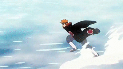
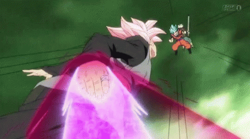
Most anime don't have Naruto's budget. And many high end anime's that do, including Naruto, have pulled off great animation without atrocious artstyle. And while the Pain sequence at least was fluid in most areas, the frame skipping in this scene here makes the movement of Pain's cloak look choppy and unnatural:
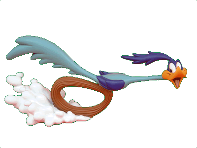
It's the same in video format. Here's fluid, quick paced action, and no matter where you pause it, you won't see grotesque artstyle:
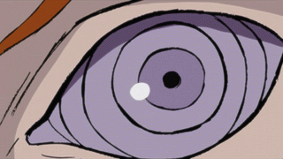
And in this instance where they skip frames, they make use of it to illustrate speed, rather than have it look unnatural:
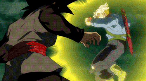
That's not to say that Dragon Ball Super goes all out on animation all the time. But it has had some amazing animation in important fights. That Pain fight was supposed to be a big moment in the anime. And they completely botched it. Here's a very good example of amazing animation with consistent artstyle at the same time (From 0:15 to 0:44 in particular):
You can see that animation quality is not the same as zoomed in stills, but it is still very very high for such a fast paced action packed animation sequence, in a 2v2 fight. That was done by a very talented animator named Naotoshi Shida. He has mainly worked on One Piece in recent times.
That Pain fight was a pointless filler sequence (none of that fight was in the manga) that was supposed to be a big moment in the Naruto series. You can clearly make amazing animation without compromising the artstyle to an unfathomable degree, when you have the budget of some of these top animes. So I'm not going to make excuses for that travesty.
Anyway, closer to the topic subject, since Dragon Ball Super has a new lead artist (not Toriyama) some characters look a bit different.
Trunks' hair for example is now blue. We were given an explanation of sorts, in that Trunks apparently always had blue hair.
- Naruto vs Pain is done way better than those 2 first DBS segments.
- DBS has worst average animation than Z, but the best ones (last video or last episode with Vegito) are better than Z's best. What's gotten worst is drawing quality. I actually think some of the times it's the same guy but he just got worst at drawing when compared to 90's DBZ which personally I think it's the best for the series