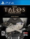
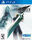
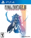
I...kinda don't like it. I find using character renders for boxart for fantasy themed games is kinda cheesy. I guess I'm used to things like Kingdom Hearts/DQ/Persona style of box art. Still gonna be bloody fun.
VXIII said:
http://gearnuke.com/final-fantasy-xv-us-box-art-reversible-cover/ |
That black background though :(
That image is so dumb. Like what the fuck I'm staring at here? The heck is Noctis doing and why is his sword hold that way? Who is Prompto facing (or why did he had the need of jumping across the car like some sort of cover, while the impending foe is just straight on the front?)? Can't anyone see how dumb is Gladiolus having to tell Noctis to just look to the front? WHAT IS NOCTIS LOOKING AT?
Thank god there's the classic logo on the reversible part.
Bristow9091 said: Nope. On so many levels. Nope. Nope. Nope. Why can't they just stick with what works for Final Fantasy? The logo on a white background? It's been that for years, why change it now? This just looks silly to me! I'm hearing there's the classic version on the reverse though, logo on white background... I'll be switching it over the second I get my hands on the case. |
Wrong. Logo on black background for the reversible.
bet: lost
I prefer those Final Fantasy animations... I don't know hot to describe them, but they're in a league all their own. The logo would have been much better imo
About Us |
Terms of Use |
Privacy Policy |
Advertise |
Staff |
Contact
Display As Desktop
Display As Mobile
© 2006-2024 VGChartz Ltd. All rights reserved.