


Tachikoma said:
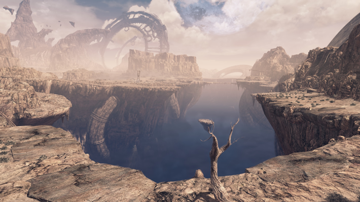
So the first issue we must address is the difference in perspective, the original shot was taken with a wider pan, further away from the primary structures, as a result of that the overall screenspace for textures to display in is reduced, note how in the second screenshot the base zoom locks to the step portion of the bridge visible midway across on the original image, with that in mind lets continue. 1) The original lighter textures have bump mapping, as illustrated by the shadow shimmer present along the left side of the structure in the original picture (displayed as almost a banding effect), these textures are also, despite the wider angle shot, higher resolution than the ones in the newer image, the structure itself is also more intricate with actual geometry used to form the triangular portion at the top, and a curved edge along the left side, this structure has been simplified and the upper triangular geometry removed to save mesh complexity in favor of drawn-in details on textures. 2) Mirroring 1, theres more texture and geometrical detail in the original here, with vent flaps and piping being realized in 3d, then drawn in as texture in the newer version. 3) Geometry of the main towers base has taken a hit in geometrical detail too, with the once smooth curve of the front supporting structure shaved down to a more angular curve, its possible to make out the edge faces from the dark beam just above the 3, there the model splits, it's likely that the orignal model was one structure and the new model is build from multiple basic structures. 4) hard to be sure but the structure of the walkway seems to have lost a fair amount of structural quality despite the newer image being closer, you would expect more to be visible here not less. 5) obvious and quite clear textures for the top of the tower have been lost and in their place more optimized (lower desnity) mesh with, likely, repeated or lower resolution textures. 6) Here we see a copy of the orginal tower in 1 from a different perspective and it underlines the difference in geometrical detailing ever further. 7) A walled gate that in the original was done in 3d and it's primary pillars reflected this fact in their lighting now stands using textures in place of geometry, and does not cast shadows upon itself based on this geometry as in the original, because the geometry is no longer there to do it. 8) Despite very similar direction of primary light source, the tower in 9 and arguably the tower between 7 and 8 to it's left cast clean shadows in the original, these shadows are nonexistant in the newer image. 9) The geometry of the tower itself is also reduced giving it a much more box-ish style without the staggered upper portions. 10) In the original the towers glass reflects both the oncoming lightsource and refracts the haze cast over the city, which in turn lights up the far left of the structures glass with a blue tinted light color, this reflective property is missing completely in the newer build, indicating either a paired back lighting system (which seems to be corroberated by the overall lighting differences in OP's video) or the simplification of the materials shader.
What we are looking at is a retexture of assets with some assets receiving lower quality textures, a fair amount of the geometry paired back and details that were once geometrical pushed over to texture data to save processing demand, it's likely that the change to a darker texture scheme was done to help bridge the difference in lighting quality, as darker textures hide the absense of high quality lighting better than light ones. I'm not trying to bash the game here, and i'm still going to be picking it up, and I will defend both the game and the WiiU in places where people try to unjustly talk shit about it, but I'm not the type to sit here and willingly brush this sort of thing under the rug, even if I'm labeled a Nintendo hater in the process of doing so. The game has, undoubtably, seen a considerable level of change since its original showing and the 2015 direct, and for the most part that has resulted in lower quality visuals. As a developer I regonize the reasons for doing so and that most games go through the process, as a gamer however, I don't condone pretending something is higher quality when it isnt. |

Can ask you a favor? When you have the time, can you make a similar analysis to the Zelda HD E3 2011 demo? and tell us if the Wii U can hand a whole game like that?
Thanks.
Proud to be the first cool Nintendo fan ever
Number ONE Zelda fan in the Universe
Prediction: No Zelda HD for Wii U, quietly moved to the succesor
Predictions for Nintendo NX and Mobile