
Frogger on 07 February 2015
That looks terrible. Someone doesn't understand color theory.


That looks terrible. Someone doesn't understand color theory.

Thank god this isn't real.
For a second, I thought Nintendo was trying to "Zelda"-fy the look of Xenoblade.
"Just for comparison Uncharted 4 was 20x bigger than Splatoon 2. This shows the huge difference between Sony's first-party games and Nintendo's first-party games."
If this happened I'd flip the hell out. Its bad enough they messed up the Captain Toad cover with the yellow backgrounds. The Japan cover was beautiful.

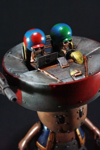
Weltall-2 is looking nice in that photo.
iPhone = Great gaming device. Don't agree? Who cares, because you're wrong.
Currently playing:
Final Fantasy VI (iOS), Final Fantasy: Record Keeper (iOS) & Dragon Quest V (iOS)
![]()


Needs more gold. Maybe the logo should be gold too instead of blue. :p
Bet with Teeqoz for 2 weeks of avatar and sig control that Super Mario Odyssey would ship more than 7m on its first 2 months. The game shipped 9.07m, so I won

The background should have white color and the doll should be just a silhouette, make it simple, that's my opinion tho. But i am OK whit what ever box they decide for. But i am hoping Nintendo releasing costume White Wii U or Black Wii U for this games and include it with bundle, because i plan to buy Wii U with this games.


Nintendo and it's gold fetish... Meh. Would like just the world, in real colors, and the mech. Show off the scope, and call it a day.
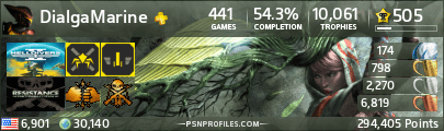
https://www.trueachievements.com/gamercards/SliferCynDelta.png%5B/IMG%5D">https://www.trueachievements.com/gamer/SliferCynDelta"><img src="https://www.trueachievements.com/gamercards/SliferCynDelta.png

I am glad that is not the real cover. I am a big fan of the Japan one.

I'm really digging the darker shade of Blue that Nintendo is using for the Wii-U portion. Hopefully they do that with more games.
0331 Happiness is a belt-fed weapon


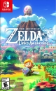

The dark version looks better imo.


Nintendo Switch FC: SW-6340-7643-4233 aka Renji
Steam: Lee Roid
About Us |
Terms of Use |
Privacy Policy |
Advertise |
Staff |
Contact
Display As Desktop
Display As Mobile
© 2006-2026 VGChartz Ltd. All rights reserved.