
badgenome on 13 March 2014
| Shinobi-san said: You MOTHER F$#%@#!!! O_O |
I expected more. 


| Shinobi-san said: You MOTHER F$#%@#!!! O_O |
I expected more.


Shouldn't they have used the same time of day, seems misleading. Or is this a scene where the lighting is always the same?


Less detail for sure, but it still looks amazing and should be the best looking console game for quite a while.
唯一無二のRolStoppableに認められた、VGCの任天堂ファミリーの正式メンバーです。光栄に思います。


pokoko said:
Facial detail? Really? Well, I mean ... they look more human, now, if that's what you mean. It's hard to say about the rest, as they changed the time of day, so it's darker. The initial lighting, though, was obviously early-stage. It looked like they were in an onmi-directional spotlight. It wasn't close to natural. I'm honestly shocked that people are calling it a downgrade. I'm a person who doesn't even care that much about graphics but this is not the response I was expecting. |
Relooking at the pics and yeah the character models definately took a hit. The detail in the beanie and the clothes in general is significantly less. :/ Also the retail shots, as BenV said, is blurry annd less refined. Look at the stones/rocks in the background also seems to have less detail. But anyways if you see it different then thats that.
I dont think this will have a big impact on the look of the game overal. We've all seen the game running already and it looks really good. Its not like we gonna be starring into delsins face the entire time :)
| BenVTrigger said: Really is mixed bag. From an art stand point I think they improved some things for sure. Delsons face for example looks slightly tweaked in a good way in terms of looks but if you zoom in on detail he clearly took a hit technically with less skin texture detail. |
You deduced all that from a compressed captured video, re-compressed on the interwebs? wow, you're a fucking genius!

| Ssenkahdavic said: Some of the character detail looks better, but overall its terrible. Everything in the background is blurry and the lighting is pretty terrible. |
Have you ever heard about Depth of Field ?? Oh Jesus...
”Every great dream begins with a dreamer. Always remember, you have within you the strength, the patience, and the passion to reach for the stars to change the world.”
Harriet Tubman.

I'm not sure...
I like the style (colors, lighting) of E3 2013 better, but the retail version looks more realistic to be.
Maybe it's only different day times and different depth of field.


| kowenicki said: Its a downgrade, obviously. Saying otherwise is a bit silly. But who cares? Does it matter... really? No. |

Dat zombie face tho.
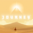
Top 10 Games of All Time
1. The Last of Us, 2. Journey, 3. Uncharted 2: Among Thieves, 4. Brothers: A Tale of Two Sons, 5. Bioshock Infinite, 6. Zelda: Twilight Princess, 7. Uncharted 3: Drake's Deception, 8. Super Smash Bros. Brawl, 9. Civilization IV: Beyond the Sword, 10. Starcraft

Add me on PSN. Thanks.
Looks better to me but not in every aspect.
The characters right away look so much better. Main character looked weird in the E3 shots. He looks more like a normal human now.
It's a mixed bag but overall I would say to me it looks just as good as it did before with all things considered. Also remember these are different times of day so it is a bit misleading.
iPhone = Great gaming device. Don't agree? Who cares, because you're wrong.
Currently playing:
Final Fantasy VI (iOS), Final Fantasy: Record Keeper (iOS) & Dragon Quest V (iOS)
![]()
badgenome said:
I expected more. |
So you said that just to get a response out of me? ie. Flaming...
Hmm i wonder if i report you if you will get banned.
The great Badgenome banned from Vgc :? That will be thread worthy! Im on it. 
About Us |
Terms of Use |
Privacy Policy |
Advertise |
Staff |
Contact
Display As Desktop
Display As Mobile
© 2006-2026 VGChartz Ltd. All rights reserved.

