Marucha said:
haha, thx. I'm glad it worked out for you :)
This drawing reminds me so much of Gokusen. I haven't watched Bleach, but Gokusen is like here's a ton of bad-ass high school kids standing around waiting to kick someone's butt... usually sitting in a sunlit park in somewhere in the middle of Tokyo saying "COME GET SOME".
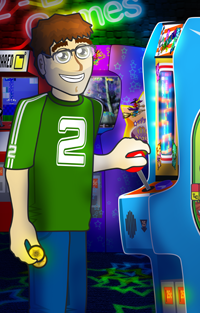
>< @ image// Very nice! Did the brush settings help at all? The shirt edge-work looks pretty good. I would not change much. Though it's maybe not as consistent with the face/neck as you pointed out. Theoretically, you could add some type of a gradient'ish blend in certain spots just where the shadow sweeps across more gradually... mmm like 'airbrush' some... kinda hard to explain without yet another paint over lol. It's a style thing. Not much to change though, the hard edge look is working for it
--
I'm not sure I fully understand your lighting. The shadows in the shirt feels out of place compared to the face/hair. It looks like the light is coming from the very top and perhaps in background behind somewhere somewhere (like the sun or something) and that puts most of the head is in shadow(?), whereas you have this overwhelming light in the shirt comparitively. The shadow locations themselves maybe should change to be consistent.
I would say play with the color temperature a bit in the shirt and plan there a bit. Either in highlight or shadow, but I think even the shadow cool use a cooler tone. You have a glow-y warmish hue in the shadow in the face and then you have this cool white for the specular highlights in the hair/nose. Your background color is a cool tone though so it works well with the general warmth of the shirt. A higher contrast in the color temperature/value (either or) could help the tough guy you're going for in lue of metrosexual. If you followed through with the stark contrast in the shirt like you did in the face, that would help that. I know you changed the base in the shirt and I agree, maybe a sliver of highlight in some places in the shoulder and collar area like you did with the nose and the hair will help better define the light and 3-dimensionality...all just a thought
The rest is styling ;)
If you're never sure, that's why I always look up references or keep a collection of images on my harddrive.
|
*** lol you nailed him XP Though he's a good guy.
*** No need, I get what you mean. Yeah, the brush settings helped create the tapered lines. Though they're not perfect, I think they're acceptable. First time really using pen pressure with work like this.
*** hmm I don't really know much (at all) about good lighting. I'll see what I can do.
*** Yeah, I see it now. Yeah, the red inner shirt still need shadows and highlghts so hopefully it'll look better after that's done. The image actually looks better without the red shirt and pants, since neither one is highlighted yet, but I thought it'd be weird to post it like that (just a floating head and shirt :p)
The drawing combines a bunch of reference images. One for the facial expression, on for the head and neck tilt, and one for the body/pose. It's a bit tricky x_x That's why the lighting is a bit weird XP - - - I can't believe you picked up on that! :-O