


| Marucha said: haha, thx. I'm glad it worked out for you :) -- I would say play with the color temperature a bit in the shirt and plan there a bit. Either in highlight or shadow, but I think even the shadow cool use a cooler tone. You have a glow-y warmish hue in the shadow in the face and then you have this cool white for the specular highlights in the hair/nose. Your background color is a cool tone though so it works well with the general warmth of the shirt. A higher contrast in the color temperature/value (either or) could help the tough guy you're going for in lue of metrosexual. If you followed through with the stark contrast in the shirt like you did in the face, that would help that. I know you changed the base in the shirt and I agree, maybe a sliver of highlight in some places in the shoulder and collar area like you did with the nose and the hair will help better define the light and 3-dimensionality...all just a thought |
*** lol you nailed him XP Though he's a good guy.
*** No need, I get what you mean. Yeah, the brush settings helped create the tapered lines. Though they're not perfect, I think they're acceptable. First time really using pen pressure with work like this.
*** hmm I don't really know much (at all) about good lighting. I'll see what I can do.
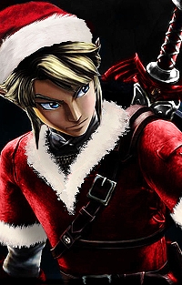
*** Yeah, I see it now. Yeah, the red inner shirt still need shadows and highlghts so hopefully it'll look better after that's done. The image actually looks better without the red shirt and pants, since neither one is highlighted yet, but I thought it'd be weird to post it like that (just a floating head and shirt :p)
The drawing combines a bunch of reference images. One for the facial expression, on for the head and neck tilt, and one for the body/pose. It's a bit tricky x_x That's why the lighting is a bit weird XP - - - I can't believe you picked up on that! :-O