NotStan on 01 March 2011
He be trolling.
Disconnect and self destruct, one bullet a time.


Looks like a very blocky version of Japanese kana to me... "surokun"

Monster Hunter: pissing me off since 2010.

I would have never gotten that if they hadn't told me, though I don't know if I would have gotten that said 2012 either.
I actually thought it was something lifted straight from the Saved By the Bell opening credits.


Um, right..
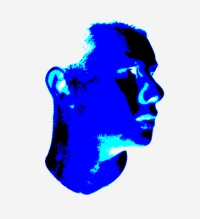
Why did they even create that logo in the first place? What was it meant to resemble? It looks horrible.


SamuelRSmith said:
|
I don't see it.
Well, it's amazing how they can interpret that...but if the suggestion gets that logo changed, I'm gonna thank Iran, because it's probably the most hideous logo I've ever seen

So, ugly = racist?
About Us |
Terms of Use |
Privacy Policy |
Advertise |
Staff |
Contact
Display As Desktop
Display As Mobile
© 2006-2026 VGChartz Ltd. All rights reserved.