aragod on 01 December 2009
darthdevidem01 said:
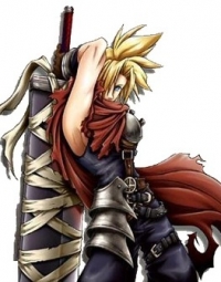
I could've made all the other FF Europe Box arts before FF13 on MS Paint in less than 2 minutes this is a STEP UP! |
Somehow I seriously doubt that, those drawings are quiete impressive. This cover is really bad imo, and this is my area of expertise...
MY HYPE LIST: 1) Gran Turismo 5; 2) Civilization V; 3) Starcraft II; 4) The Last Guardian; 5) Metal Gear Solid: Rising