
Galaki on 12 October 2007
old one is better.
the icons for games boxart is fine, just not the user icons.


old one is better.
the icons for games boxart is fine, just not the user icons.

Sorry ioi but I'm with girl gamer (never thought I say this though). The boxart are cutted and to small. You have do look closely do decipher that is actually the boxart you are seeing. Either you go back to the PS3/Wii images, or you make the part bigger, so the you don't have to downsize the images so much.
Join up to the VGC Mario Kart Wii GP European League!
Or the VGC Mario Kart Wii GP Australian League!
Or the VGC Mario Kart Wii GP American League!
Or the VGC Halo 3 American League!
Or the VGC Call Of Duty PS3 League!


It's kind of a mess, but I like seeing avatars next to the titles.
My themeforest portfolio:
It is not perfect (I'm at work), so I done this quick n dirty, but te be not just critical and hopefully be kind of assistance look at that:

I have redone the American charts. It has gone a little big, but again thats quick n dirty. That way you can fit the top 3 in the box, and add more info (last week). And it does look better with a "full" boxart. Just an idea ioi.
Join up to the VGC Mario Kart Wii GP European League!
Or the VGC Mario Kart Wii GP Australian League!
Or the VGC Mario Kart Wii GP American League!
Or the VGC Halo 3 American League!
Or the VGC Call Of Duty PS3 League!

If you want proffessionalism IoI you should have left the top five games the way they were too, those 'Wii', '360', 'Ps3', 'DS', 'PSP' icons really had a professional feel to them. Anyone can put up a sloppy shrunken picture of the game, those icons were what set your site apart from many others as simple as they were.

I agree. How does the site look more professional when you have stupid looking avatars of people put up for display? Some of the avatars are almost PG-13ish and that definitely is professional. *rolls eyes*

After scrolling through the most recent forum posts on the main page I want to go running to my DS to fix my eyes with the Vision training. Seriously your website gives me headaches now. My EYES HURT!


I have to concur with the opinions of most of the others in the thread. The front page is too busy now. It has a messy look to it. There is too much going on. For a first time viewer of the site, it could be overwhelming.
No problem here, works fine with me, no complaints at all, good work ;)
PLAYSTATION®3 is the future.....NOW.......B_E_L_I_E_V_E
Supporter of PlayStation and Nintendo

Don't have problems with the avatars, especially in the news section it's a very good idea, gives some credit to the posters.
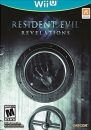
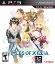
The top 5 games look messy and make it less clear. The console the game is on is far more interesting than a cropped box art. Especially since platform ads to the console sales next to it.
About Us |
Terms of Use |
Privacy Policy |
Advertise |
Staff |
Contact
Display As Desktop
Display As Mobile
© 2006-2026 VGChartz Ltd. All rights reserved.