By using this site, you agree to our Privacy Policy and our Terms of Use. Close

Forums - Nintendo - Good bye good ol' red logo

nordlead said:
If they changed it to anything, they should have made it a glowing blue, since it is so addicting.

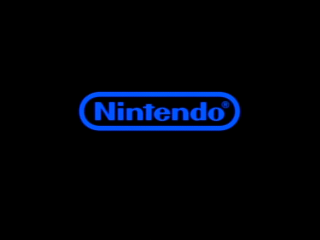
Japanese Nintendo logo was blue before the current change ( european and american ones were red ).


 “In the entertainment business, there are only heaven and hell, and nothing in between and as soon as our customers bore of our products, we will crash.”  Hiroshi Yamauchi

TAG:  Like a Yamauchi pimp slap delivered by Il Maelstrom; serving it up with style.

Around the Network

I could see this coming...the official Nintendo Magazine here in the UK has used a grey logo on every cover for months...I thought it was to look nicer on the white backgrounds.

It does kind of 'fit' when you see it on a Wii game's box, or on the corner of an advert, nice and subtle. It was time for a change, they've been using the old one for 20-odd years.

(I'll miss it though).

Times are changing.


My Blog, Please Have A Read:

http://Proseandconsoles.blogspot.com

Party Monster said:
I've seen the Nintendo logo in a lot of different colors over the years.

Blue and red ?

And obviously the recent gray/silver.


 “In the entertainment business, there are only heaven and hell, and nothing in between and as soon as our customers bore of our products, we will crash.”  Hiroshi Yamauchi

TAG:  Like a Yamauchi pimp slap delivered by Il Maelstrom; serving it up with style.

Quote: "For several years, a new generation of Wii and Nintendo DS games have adorned themselves with a new logo, in discrete grey."

The logo switched long ago.


hentai_11 said:
Quote: "For several years, a new generation of Wii and Nintendo DS games have adorned themselves with a new logo, in discrete grey."

The logo switched long ago.


Yeah but if you read more than just the first line you'd realise the Nintendo PR department has now asked employees not to use the red logo at all, anywhere, making the change official and complete. Now, no matter where it is, we'll only see the grey logo on anything new.



My Blog, Please Have A Read:

http://Proseandconsoles.blogspot.com

Around the Network

Well from a marketing standpoint, apparently Red (and Yellow) are the most attractive colours to buyers (which apparently explains McDonald's, KFC, Red Rooster etc). I'm not exactly sure if it's a fact though. But if it's true, then bad Nintendo.

I prefer the red personally. Also, I thought I should throw this out there, the only reason I clicked on this thread was because I misread the title as "good bye good ol' red lego".


NOOOOOOOOOOOOOOOOO BOOOOOOOOO RED IS SO MUCH MORE EXCITING THEN GREY
this makes olimar sad


Wiped said:
hentai_11 said:
Quote: "For several years, a new generation of Wii and Nintendo DS games have adorned themselves with a new logo, in discrete grey."

The logo switched long ago.

Yeah but if you read more than just the first line you'd realise the Nintendo PR department has now asked employees not to use the red logo at all, anywhere, making the change official and complete. Now, no matter where it is, we'll only see the grey logo on anything new.

If you had read the headline than you would know that it was adressed to media partners and not employees.

I am pretty sure that Nintendo uses the grey logo at least 2 years now. And it doesn't look like it hurt their sales numbers.


llewdebkram said:

I prefer this one:

^ White on a white background is just so revolutionary!


would have suited the wii when it was first announced as the revolution, don't ya think? lol

SSBB Code: 5327-2374-8112

MKWii Code : 3780-9266-6102

CoD WaW Code: 1376-1190-5157

Huh. I remember that grey logo being on a lot of stuff.

Like wasn't it on most SNES gear?