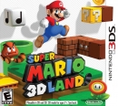
I could see this coming...the official Nintendo Magazine here in the UK has used a grey logo on every cover for months...I thought it was to look nicer on the white backgrounds.
It does kind of 'fit' when you see it on a Wii game's box, or on the corner of an advert, nice and subtle. It was time for a change, they've been using the old one for 20-odd years.
(I'll miss it though).
Times are changing.
Existing User Log In
New User Registration
Register for a free account to gain full access to the VGChartz Network and join our thriving community.


