By using this site, you agree to our Privacy Policy and our Terms of Use. Close

Forums - Website Topics - So... What's the plan for VGC going forward?

Machina said:

I like it.

Obviously there'd be changes to the design. It's missing social media icons, the proportions would need to be reworked, the third sales box would probably be for latest charts, and we'd need to use the current logo, etc. But in general it's a layout I'd prefer over the current one.

I particularly like having the menu options clearly accessible down the side with the VGC Buddy, a bit more focus on articles, and a Supporter tab. It's also not a drastic change but is an improvement, and I agree with Spurge that is where a lot of site revamps go wrong - they change too much and try to make the redesign too flashy and completely different, which ends up alienating people.

-----

Completely agree that you should be able to make it permanent. In fact I'd say that should de default when logged in, and then there'd be an option to have it reduced/hidden.

Thanks! I 100% agree with everything. I was only shooting for a general idea, so most of what was there is just a general placeholder to give people an idea of positioning and general asthetic. The third sales box was indeed meant to be a place holder for the latest sales charts. I just couldn't find an image and don't know enough about using the program to crop it myself lol. Same with the logo.

Yeah, I mostly wanted to make a redesign that put better focus on specific aspects of the site that kind of get buried, primerily the articles.

As for the VGC Buddy, it is always open by default. The only way to get rid of it is to manually close it by pressing the tab, so it's an OFF button rather than an ON button. I based it functionally off this:

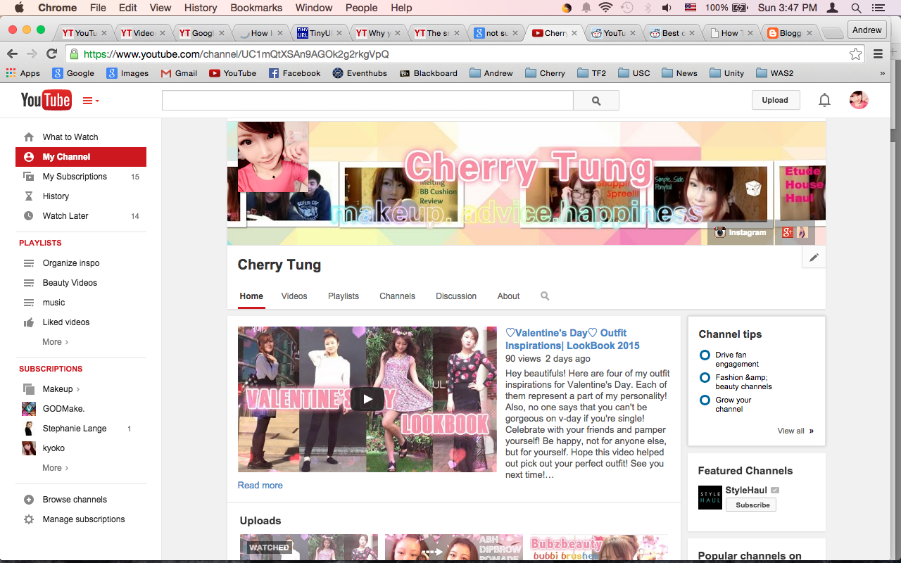
As I said to Platina, the nice thing about it is that it always frames the site. It also has a scroll wheel independant of the scroll wheel on the main page. It isn't shown on this image, but this is really convenient because it allows you to scroll through all your subscriptions on the side without effecting the page you're viewing. I wasn't sure how difficult that would be to code if incorperated to the VGC Buddy, which is why I didn't add that on the sample, but it would allow for a lot more stuff to be placed on the Buddy, including more threads. I mentioned to Platina that this would be an awesome place to put the Game BG search bar, because it would be always present, even when you're in the forums, which would be so convenient.

In fact, a lot of what is at the top of the page could be put there, with then having more content specific tabs be placed at the top banner. This way the navigational stuff is always at the side, while the more specific stuff could be at the top, like specific platforms for example. That's just me rambling, though.

EDIT: Also, with the social media icons, Gamespot does this really smart thing where they just have a small "share" icon on their banner, and when you click/hover over is, it presents a small drop down menu with all their social media icons on it. It's very slick and takes up like no space. And it looks good.


Around the Network
spemanig said:

It also has a scroll wheel independant of the scroll wheel on the main page. It isn't shown on this image, but this is really convenient because it allows you to scroll through all your subscriptions on the side without effecting the page you're viewing. I wasn't sure how difficult that would be to code if incorperated to the VGC Buddy, which is why I didn't add that on the sample

It's practically trivial to make it have an independent scroll using the "overflow scroll" property. Styling the scrollbar takes a bit more effort, but here's a working example: http://codepen.io/anon/pen/XdKVMN


JoeTheBro said:

It's practically trivial to make it have an independent scroll using the "overflow scroll" property. Styling the scrollbar takes a bit more effort, but here's a working example: http://codepen.io/anon/pen/XdKVMN

Ah good! That would be perfect!

Again, clearly I don't know the first thing about coding. I don't even know the second!


spemanig said:

This is the best I could do... Again, keep in mind that I have literally never used photoshop or any similar software in my life before today.

Also, I cut corners with some stuff because it's just a sample.

Also, Also, the big red rectangles are the Ads.

Also, Also, Also, this is meant only to show off the layout, so none of the art design choices should be taken seriously.

Also, Also, Also, Also I had a REALLY difficult time with this, so not everything is scaled correctly. But here it is...

EDIT: Also, Also, Also, Also, Also, I know it's blurry when you zoom in. I tried to upload the original file, but I'm not good at this shit and it wouldn't load a higher quality. :'(

Great work! Your concept looks fresh and would revitalize VGC's look without going overboard and throwing everything we currently have out the window.


Signature goes here!

TruckOSaurus said:

Great work! Your concept looks fresh and would revitalize VGC's look without going overboard and throwing everything we currently have out the window.

Thank you so much! It was very difficult to manage lol.

Did you see my idea for the VGC Buddy having an added scroll wheel as well as incorperating more tabs and the Game DB search bar? Do you think that is feasable? I wasn't able to incorperate in into the concept because I wasn't sure how to represent it (or if it would've been unreasonable to code).


Around the Network
spemanig said:
TruckOSaurus said:

Great work! Your concept looks fresh and would revitalize VGC's look without going overboard and throwing everything we currently have out the window.

Thank you so much! It was very difficult to manage lol.

Did you see my idea for the VGC Buddy having an added scroll wheel as well as incorperating more tabs and the Game DB search bar? Do you think that is feasable? I wasn't able to incorperate in into the concept because I wasn't sure how to represent it (or if it would've been unreasonable to code).

Having a scroll bar for the buddy could be a nice way to have more than 15 topics on your buddy without taking too much space. The extra tabs are a good idea and are doable.


Signature goes here!

TruckOSaurus said:

Having a scroll bar for the buddy could be a nice way to have more than 15 topics on your buddy without taking too much space. The extra tabs are a good idea and are doable.

Okay that's awesome. Would it be doable to also have the database search bar in the buddy, kind of like what Wiki-sites do with their sidebar? I figure it would be much more convenient if it was there, and it would encourage people to use it more regularly. I was thinking something like:

VGC Buddy

-------------------------------

Home

Articles

Charts

Forums

Tools

Database

------

Database Search Bar

------

Profile

Notifications

Messages

Friend Requests

------

Recent Threads

- So... What's the plan for VGC going...

Nintendo's 2016 E3 Digital Event...

Capcom working on Devil May Cry 5?...

- Etc.

- Etc.

- Etc.

- Etc.

- Etc.

- Etc.

- Etc.

- Etc.

- Etc.

- Etc.

- Etc.

- Etc.

- (How ever many topics you'd like)

------

Settings

Log Out

------------------------

Then you could reserve the top banner for stuff like specific hardware platforms, specific types of articles, or other things of that ilk. 


spemanig said:
TruckOSaurus said:

Great work! Your concept looks fresh and would revitalize VGC's look without going overboard and throwing everything we currently have out the window.

Thank you so much! It was very difficult to manage lol.

Did you see my idea for the VGC Buddy having an added scroll wheel as well as incorperating more tabs and the Game DB search bar? Do you think that is feasable? I wasn't able to incorperate in into the concept because I wasn't sure how to represent it (or if it would've been unreasonable to code).

Your image has expired and I wanted to check it out because I'm trying my hand at doing a new design and I wanted to incorporate some of your suggestions in there. Do you think you could re-upload it?


Signature goes here!

spemanig said:

If it were up to me, there wouldn't even be any sigs lol but I imagine that would be very unpopular.

I've always thought that the signature should only appear in a member's first post in a thread. After that, should be hidden behind a "click to see signature" link. I have the 100-post setting enabled, I don't need to see the same gif 20+ times on a single page.


TruckOSaurus said:

Having a scroll bar for the buddy could be a nice way to have more than 15 topics on your buddy without taking too much space. The extra tabs are a good idea and are doable.

Was the original idea behind the "buddy" more than just your latest threads? The word "buddy" implies that it should be more than that.

Notifications, messages, friend requests should be built into the buddy. Perhaps build in the search box and some kind of "personal pins" too.