


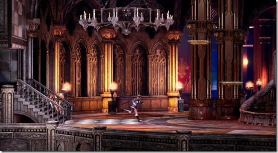
Background 1 / Character 1
image: http://www.siliconera.com/wordpress/wp-content/uploads/2016/01/sfELXMi_thumb.png
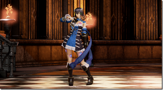
image: http://www.siliconera.com/wordpress/wp-content/uploads/2016/01/5lTPC7s_thumb.png
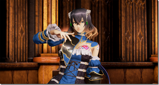
image: http://www.siliconera.com/wordpress/wp-content/uploads/2016/01/rkuKDLi_thumb.png

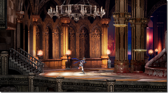
Background 1 / Character 3
image: http://www.siliconera.com/wordpress/wp-content/uploads/2016/01/naRIQEi_thumb.png
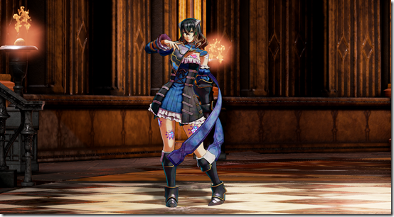
image: http://www.siliconera.com/wordpress/wp-content/uploads/2016/01/cHYWiJk_thumb.png
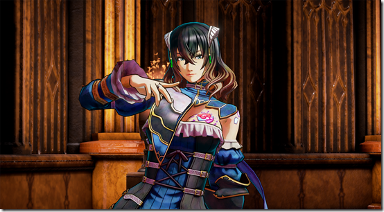
image: http://www.siliconera.com/wordpress/wp-content/uploads/2016/01/Btujp9E_thumb.png
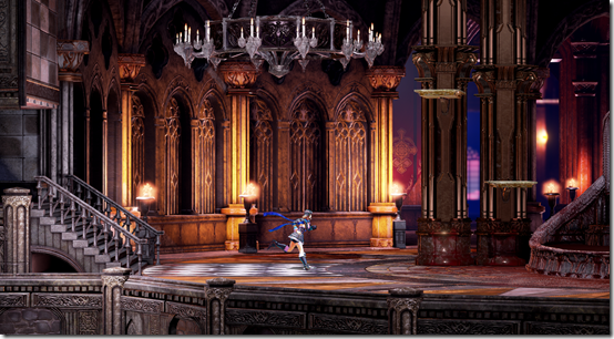
Background 3 / Character 1
image: http://www.siliconera.com/wordpress/wp-content/uploads/2016/01/mg5dTR6_thumb.png
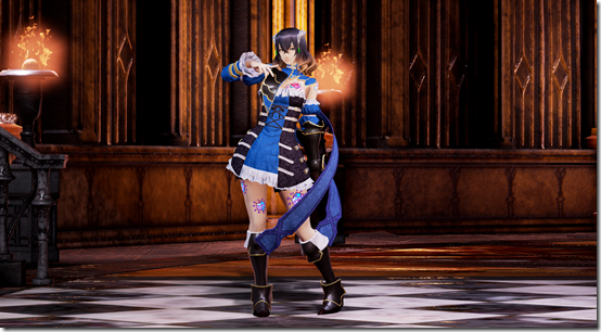
image: http://www.siliconera.com/wordpress/wp-content/uploads/2016/01/N75Cgqb_thumb.png
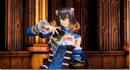
image: http://www.siliconera.com/wordpress/wp-content/uploads/2016/01/PUQ3a9U_thumb.png
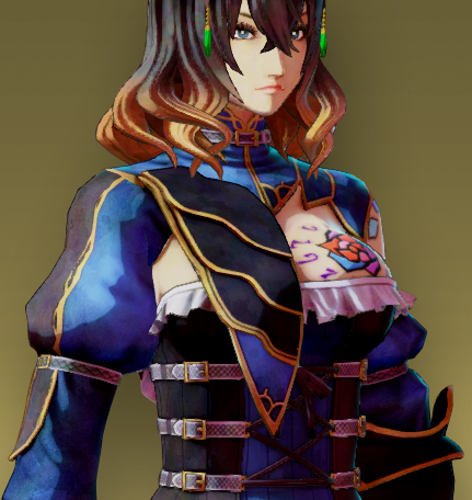
Background 3 / Character 3
image: http://www.siliconera.com/wordpress/wp-content/uploads/2016/01/hzvAbBh_thumb.png
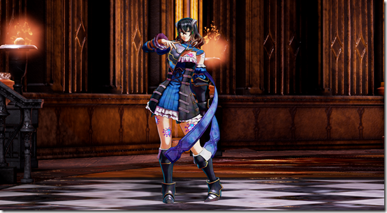
image: http://www.siliconera.com/wordpress/wp-content/uploads/2016/01/Vpx22px_thumb.png
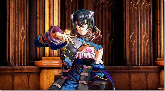
image: http://www.siliconera.com/wordpress/wp-content/uploads/2016/01/Pfdx797_thumb.png
And finally, comments from IGA:
Greetings!
Last time, we turned to the backers for input on which shaders to use in the game. Based on that, we’ve gone back and put tons of time into making improvements. In particular, the background we revealed in the previous update was just arranged for our own experimentation; for this update we’ve put much more detail into it. This may make it easier for you to see which direction we’re aiming for.
Of course, as we add more detail to the background the characters become more prone to blending into the background. Some of you have noticed the characters’ proportions changing in the art and early screenshots—we’re making adjustments as we build the game to maximize the contrast between character and background. We’ve made more changes for this update, and adjustments will likely continue as we get farther into development.
One you may notice is that Miriam has two long ribbons attached to her shoulders now. When we tested her original graphic, it was hard to pick her out against the background, because there wasn’t much on her costume that moved or swayed. (The design of her left shoulder has changed, too, as some of you pointed out; this is the reason why.)
For this third shader, we’ve increased the contrast of the background and edited the lighting to polish the overall effect. The first shader also looks different against a more detailed background, so I think there’s a different effect to that one, too. Which one do you guys like? To be honest, opinions are divided within our team!
We spent an enormous amount of time and effort on this third character shader to create an illustration effect. We tried to get closer to the requests of backers who hoped she would look more like the original design illustrations, and when I first saw this shader, I have to admit I was so impressed I actually gasped.
So we’ve compiled a few options of these background and character shaders put together and would like to see what you think. And, as I’ve pointed out in the latest Ask IGA, this will be our final request for art-direction feedback. I’d like to ask for any final thoughts you have now, so we can move forward and start putting things in motion. – IGA
Read more at http://www.siliconera.com/2016/01/21/bloodstained-ritual-night-updates-new-images-asks-fan-feedback/#ucPvdQQQ58wFmVmJ.99
Shader #1
Here's IGA's comments about the first set of shaders:
This shader contains lighting, fog, and character brightness effects designed to give it a 2D look. I feel bad about how much I demanded from the development team!


Shader #2
Here's what IGA has to say about Shader #2
For this shader we desaturated the colors, enhanced the shadows, and used hatched lines to fade between light and shadow. I think this one looks especially unique.


IGA and Inti were excited to finally get the chance to show you some of their work and hear from you before they lock this part of the game down—we hope you like it, and we're looking forward to showing you more later this month.
We've set up a Google Form you can use to submit your feedback. Thanks for being a part of the return of Igavania! Your excitement is what's driving IGA and the developers.
We expected feedback, and we knew it would be useful. (We know you, after all.) But we didn't expect the sheer volume of useful feedback you guys submitted about the first round of shaders. We collated the thousands of comments and suggestions as best we could, passed them along to Inti Creates—what you liked, what else you wanted to see, what you thought they should work on—and they've been reading through them and working on the next set of screenshots ever since.
The work kept them from hitting their end-of-December goal. So here, by way of an apology, is a teaser image IGA passed along to us: Miriam demonstrating a shader Inti Creates has been refining.
IGA's comments:
Since we heard that the backers wanted a more illustration-like feel, we had Inti Creates work on several methods of making that possible. Out of the options they showed us, we really liked this "toon" shader right away. The background is not ready yet, but I've had them put together a preview of just Miriam. I hope you can understand why we like it so much.


