VaultDweller on 17 June 2015
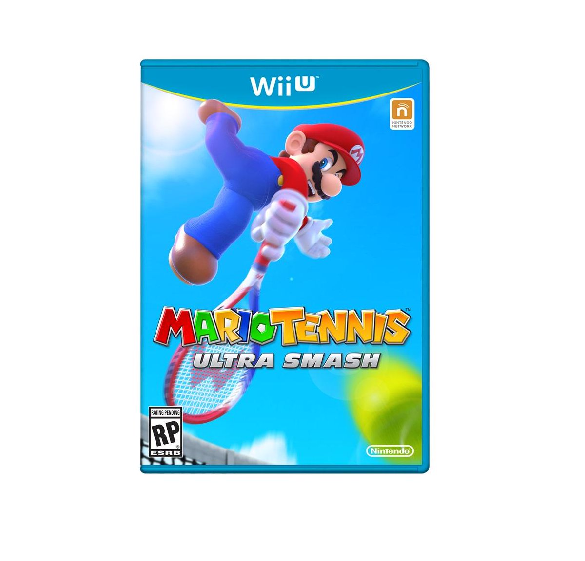
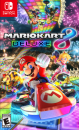
I liked the tennis boxart. Clean and beautiful.


I liked the tennis boxart. Clean and beautiful.
| mZuzek said:
Wow, just.... wow. It's like they don't even want to pretend this is an exciting game. That's the most boring and generic box art I've ever seen. I mean, Star Fox Zero's box art looks silly, but at least they were trying on that one. This is just like "yeah, there's this game no one cares about". |
I'm hoping it's a stand-in.
But I doubt it.

star fox and super mario makers boxart is great
NND: 0047-7271-7918 | XBL: Nights illusion | PSN: GameNChick


| mZuzek said: I'm not. That boxart perfectly represents what the game is, it should stay. |
Is it just me, or did the actual game not look that bad?
Sure, it's not the game I wanted. Hell, it's not even the Mario Sports game I wanted, but I haven't seen anything necessarily wrong with it. It was just revealed at the wrong time.
...But I only buy games digitally, so...
*shrug*
| mZuzek said: It doesn't look bad. There's nothing wrong with it. It's just what it is. It's Mario Tennis. It's not exciting, it's not innovative it's nothing special. All of that applies to the box art. |
Meh, I guess.
Still wished it looked better. I don't want an ugly box on my shelf (if I ever decide to get this). 
| VaultDweller said: I liked the tennis boxart. Clean and beautiful. |
So "clean and beautiful" there's nothing on it that catches attention, except for how bland and generic it looks.
Granted Mario games have a whole history of terribly generic covers, and most of them sold millions. Want an example of "clean and beautiful" in a Mario game cover though? Here:


There are Mega Evolutions in Pokémon Super Mystery Dungeon too?! Ugh.
noname2200 said:
Looking at some of the videos, so could the game. |
Are you serious? I thought the game was suppose to be colorful. :/
About Us |
Terms of Use |
Privacy Policy |
Advertise |
Staff |
Contact
Display As Desktop
Display As Mobile
© 2006-2026 VGChartz Ltd. All rights reserved.