MoHasanie on 22 July 2014
I like the new logo. Its a bit boring but its colorful.


NNID: FrequentFlyer54


I like the new logo. Its a bit boring but its colorful.
NNID: FrequentFlyer54

Don't forget:
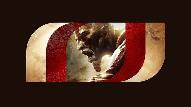
"Our new logo, with its bold, simple structure can become a frame to the world of our games, filled with elements of the game such as key colors, textures, game content and screenshots. When you see the new animated logo boot up with our next external dev games such as Fat Princess: Piece of Cake and Hohokum, you’ll further understand how we crafted a mark that allows our games to visually become part of the brand."
kitler53 said:
and that's all from the last 4 years (expect for fat princess,. i love that game). they are a diverse studio making great games but also managing the colloborations with tons of other studios. |
Sure I think that is the main reason for a change and the "future" article as a company for it, SSM became the American version of Sony XDev Europe. And as much as I like some of those games I would take another God of War over all of them combined without a second of hesitation. So for me it's a shame, as it looks like they are going for this direction, maybe with more focus than before.
So it is happening...PS4 preorder.
Greatness Awaits!


| kitler53 said: |
I especially like how the new logo can be used to present games from their library, with the left and right part serving as a frame and the middle part as the picture.
Signature goes here!

The old one was horrible. The news one is good but lacks inspiration.
Also Hohokun and Journey are not Santa Monica games, just published by them.
As for God of War, they milked the franchise too much, so I hope they wait long before releasing a new next-gen one, and create a new franchise instead (The Order looks meh)
| goulibouli said: Also Hohokun and Journey are not Santa Monica games, just published by them. |
No..they are co developers. Just like in The Order
Too bland, I prefered the last one.

duduspace11 "Well, since we are estimating costs, Pokemon Red/Blue did cost Nintendo about $50m to make back in 1996"
http://gamrconnect.vgchartz.com/post.php?id=8808363
Mr Puggsly: "Hehe, I said good profit. You said big profit. Frankly, not losing money is what I meant by good. Don't get hung up on semantics"
http://gamrconnect.vgchartz.com/post.php?id=9008994
Azzanation: "PS5 wouldn't sold out at launch without scalpers."

Just release your Nordic spiritual successor to God of War and I'll be much more interested
(I'd take Egypt or sci-fi too)

Now i want a t-shirt that says "I waited for a new God of War game, and all i got was this lousy logo"
“It appeared that there had even been demonstrations to thank Big Brother for raising the chocolate ration to twenty grams a week. And only yesterday, he reflected, it had been announced that the ration was to be reduced to twenty grams a week. Was it possible that they could swallow that, after only twenty-four hours? Yes, they swallowed it.”
- George Orwell, ‘1984’
About Us |
Terms of Use |
Privacy Policy |
Advertise |
Staff |
Contact
Display As Desktop
Display As Mobile
© 2006-2026 VGChartz Ltd. All rights reserved.