happydolphin on 31 August 2012
| Kresnik said: Eye think this is pretty U-gly. |
Mind = blown.


| Kresnik said: Eye think this is pretty U-gly. |
Mind = blown.

| Kresnik said: Eye think this is pretty U-gly. |
U sir have a great Eye for detail.


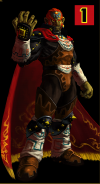
I think especially for a launch title, this might affect its sales. I remember Nintendo talking about how the Professor Layotn cover was changed to be more appealing for Americans, and it actually worked for them. This is just horrid

Normal for me, not bad but not good also.
Question, what is the size of these boxes, DVD size or Blu-ray size?

I like the eye, but the zombie coming right out looks bad.
The cover is indeed ugly........
This one looks better.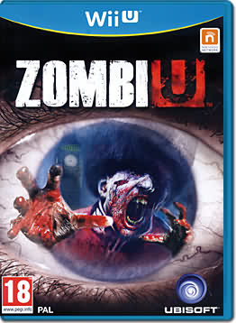
Btw I always wondered why noone cam up with this:
I just tilted the U and made it an E and IMHO this looks better. The U was infected and collapsed :)
And we could call it Zombie instead of ZombiU (I never liked that name)

| flagstaad said: Normal for me, not bad but not good also. Question, what is the size of these boxes, DVD size or Blu-ray size? |
Judging by the box shape, I think it's DVD size; should be the same size as the Wii box.


Still better than the Skyrim case.


| JazzB1987 said: The cover is indeed ugly........
|
I like the fake one better; more darker and atmospheric (is that even a word?).
About Us |
Terms of Use |
Privacy Policy |
Advertise |
Staff |
Contact
Display As Desktop
Display As Mobile
© 2006-2026 VGChartz Ltd. All rights reserved.