By using this site, you agree to our Privacy Policy and our Terms of Use. Close

Forums - Website Topics - The VGC 3.0 Complaint/Suggestion Thread

miz1q2w3e said:

Someone sent me a friend request

the problem was that it showed up as three friend requests, then when i accepted one of them, the dude showed up in my friend list as three separate individuals. so then i wanted to remove the other two so i clicked "remove friend"... now he's gone from my friend list and i can't add him either

can you guys help??

Almost exact same thing happened to me, except he appeared twice in my friend list. Deleted one of them, they both disappeared, and now the "add friend" button on his page is greyed out for me. So it's like he is in my friend list, but he is not.


Around the Network

I tried to upload four screenshots to a game, but when I started uploading, I got to this URL: 

http://gamrreview.vgchartz.com/assets/game_includes/uploadscreens.php

And it just showed a '0' and didn't go any further.

Chrome 5.0


I liked how all the site functionality was built around the sales numbers, which is (or atleast was) the main feature of vgchartz. This fragmentation in 4 separate sites is unnecessary, wastes ppl time, and, speaking for myself, I have no time to waste for switching from site to site. The old site had all in one place, I could have a one minute sweep, see what interests me, the site wasn't a glowing example of great graphics design, but atleast it was functional.

My eyes hurt from the white background (on a computer screen, dark background with white text is easier on the eyes - web design 101), and the lack of contrast between green parts of text and the background is horrid.

There seems to be much more scrolling needed, atleast in the news site. Also, in the news there is a nice set of buttons for easy sharing on hte left side in the beggining of the post. But then again, beneath the post there is a large "share this" box with huge icons - unneccessary and redundant.

New VGchartz is almost monochrome. The color coding in the charts (which was the main clue to differ games for Sony, MS and Nintendo systems) is gone, and this totally kills the readability of the chartz.

Where are the comments in the games pages?

Anyway, this site might gone up a thumb or two in the design department, but it gets 10 thuumbs down in the  function and readability segment.


.

joora said:

I liked how all the site functionality was built around the sales numbers, which is (or atleast was) the main feature of vgchartz. This fragmentation in 4 separate sites is unnecessary, wastes ppl time, and, speaking for myself, I have no time to waste for switching from site to site. The old site had all in one place, I could have a one minute sweep, see what interests me, the site wasn't a glowing example of great graphics design, but atleast it was functional.

My eyes hurt from the white background (on a computer screen, dark background with white text is easier on the eyes - web design 101), and the lack of contrast between green parts of text and the background is horrid.

There seems to be much more scrolling needed, atleast in the news site. Also, in the news there is a nice set of buttons for easy sharing on hte left side in the beggining of the post. But then again, beneath the post there is a large "share this" box with huge icons - unneccessary and redundant.

New VGchartz is almost monochrome. The color coding in the charts (which was the main clue to differ games for Sony, MS and Nintendo systems) is gone, and this totally kills the readability of the chartz.

Where are the comments in the games pages?

Anyway, this site might gone up a thumb or two in the design department, but it gets 10 thuumbs down in the  function and readability segment.

I kind of agree with him...I understand that you guys have not implement all the new and old features to the website but the new design doesn't grow up on me at all. Maybe I was'nt posting often but I'm visiting this website everyday...now I spend less time around.

I want the click on a game and get the sales numbers, access the review, see how many of us want the game, own the game and else. We loose so many little thinks that make this site unique and special.I hope this site will stay that unique and special and not become a clone of IGN and Else...


I do appreciate many of the subtler improvements that have been made to the site with 3.0.  The way your sidebar auto-updates when you recieve wall posts, PMs, etc. without having to refresh in particular is quite nice.

I think the reason this thread is filled mostly with criticism while little praise is given to some of the great improvements you guys have made is because:

1.  People like to bitch.

2.  Most of the improvements are, like I said, quite subtle.

Many of these improvements go a long way towards making the site a more streamlined and swifter experience, however, I must stress yet again that these improvements are outweighed by other issues as things currently stand.  Small time savers like not having to refresh to find out you've been messaged mean squat when you're clicking pages left and right anyway, and in the end the fragmented and rather convoluted layout of 3.0 means that you'll ultimately spend far more time going from page to page in an attempt to find information that was right in front of your face under 2.0 anyway.  All these little time savers are outweighed heavily by having to use four different websites to perform what used to be fairly simple tasks under the old design.

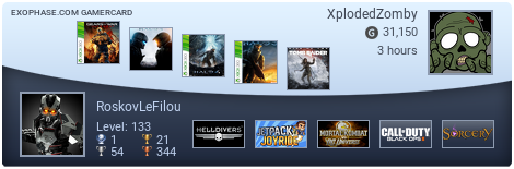
My biggest issue so far is having two entirely separate game databases, neither of which you can search through via gamrConnect DESPITE the fact that you manage your game collection entirely via gamrConnect.

In the end, VGChartz is a site dedicated to the reporting, analyzing, and discussing (via the forums) of sales numbers.  Yeah, over time we've added on news and reviews and whatnot to make the site a more fully featured gaming site, but the focus at its core has never changed.  The issue with the new site deisgn is that it breaks apart some of the site's most basic features (notably the relationship between front page sales, our database of games and their sales, and the forums), thus making the core of what made this site so unique and awesome less of a core.  It feels like there's no center to the site anymore, and the four pages feel fairly unrelated.  Having to go a to a different website from gamrConnect to find anything worth discussing on gamrConnect, for example, inhibits discussion, and it makes it seem like this isn't even VGChartz anymore.

Honestly, gamrConnect now feels like it's JUST a forum.  Yeah, it has links to the other VGChartz sites at the top, but other than that, what does it have over any other random forum?  Despite all the features like wall posts and whatnot, I could easily replace it with any other forum and browse VGChartz at the same time.  Granted, the community keeps me here, but why did that community build up?  Because they liked the forums that were a part of VGCharts.  Fully integrated into the whole.  Not tacked on at the end.  They were the VGChartz forums.

I'm sure the quitetness of the forums this past week (despite news like the Killzone 3 trailer, the MotorStorm 3 and Infamous 2 announcements, Xenoblade's release and live streaming, the Portal 2 delay, among other things) can be attributed to the redesign.  The thread about MotorStorm has been up for almost 20 hours and it hasn't even broken a page (50 posts/p)!  It's averaging 1.5 posts an hour.  Though I suppose that means we've finally managed to cut down on the number of Sony fanboys running around.  :P


Around the Network

makingmusic476 I see a contradiction in your post. You apparently agree with much of the criticism, which one wouldn't find by just reading your summarized 2 points.

Apparently what you meant was that people are bitching because:

1- People like to bitch.

2- The improvements were subtle.

3- The disadvantages of VGC 3.0 are quite obvious.

Apologies if I misunderstood you.


My Mario Kart Wii friend code: 2707-1866-0957

I like the new look..but WTH happened to my game sales and hardware sales graphs...I can't find them, can't compare can't do any research.

This is annoying.


Please VGchartz! at least remember your original values!


@makingmusic476 

This thread is specifically for complaints and suggestions.


There's a problem with " ' ":

http://www.vgchartz.com/game.php?id=14176

http://www.vgchartz.com/game.php?id=21685

http://www.vgchartz.com/game.php?id=31689


Not to be mean or cruel, but the site looks terrible. It's a confusing mess and the color/font schemes is all wrong. Please.. please change the site back to the way it was. There was absolutely nothing wrong with the original site. I can't even find the news anymore. Uuhhgg!! This is a friggin disaster. Why are the fonts light grey and washed out on the charts. I can't even read the ( & -) tags. Why wasn't this beta tested with users prior to going live?


__________________________________________

'gaming till I'm gone'