JamaicameCRAZY said:
"Tell me how you really feel. But seriously i appreciate the feedback."
"Obviously you can think however you would like thats your opinion and that fine. Feel free to elaborate on the blandness and how uninteresting the colors are also. "
How am i not able to take criticism? You trashed every aspect of my picture in the most blunt way possible and i said i appreciate the feedback. And now you are defensive and saying i need to learn how to do art. I think you are the one that needs to chill out. You have an opinion and thats fine i dont mind hearing negitive criticism and learn a thing or two. But if you are going to go out of you way to pick apart something i do and be wrong about how you try to criticise im going to say something. Now feel free to elborate on the rest of your criticism.
|
I did go overboard, I agree I interpeted your posts wrong. But it wasn't necessary for you to go on a tangent about me calling your drawing a caricature. I keep feeling that if you didn't call it a comic book cover things would have looked quite different. My criticism was simple, yes, and although I'm satisfied with what I said, I'm going to give you more since you've put me in the corner (deservedly so, I must admit).
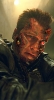
Honestly I'm a bit confused, the cover is this caricature of Gerard Butler ( :p ), yet how does the main character look like? What is the comic about? Is it about a regular joe without a single defining characteristic except a broken neck standing in the middle of the street? Is it about Gerard Butler getting his head caught in a vise? Even artsy comics need covers that say something, or if there's focus on the face, make it look interesting and engaging. An audience which reads violent comics 24/7 is not going to be engaged by mere proposition of violence. You're making the audience ask a very simple, very broad question, "where does the violence come from", but you're not giving them a single clue.
About the blandness, yes, it looks like one of those Hollywood posters. Would have been a bit better without the buildings, or at least without the buldings framing his face so exactly. Had you taken a picture of your friend like this, it wouldn't have been a very interesting photograph. The buildings are blue and reddish-orange, the sky is blue and reddish-orange. That doesn't make for much contrast. And the buildings take too much attention away from the face without being interesting.
The face itself is too realistic. It's also copied from a photograph of a famous person which isn't serious at all. There's little original about this character you're presenting. He's looking us in the eyes with those pleading eyes of his and saying "Help me.". His lips look somewhere between a smirk and failed plastic surgery. He doesn't seem tough, he doesn't seem special, he doesn't seem interesting at all.
You've gone overboard with attention to detail, so much so that you've failed to add any interesting touches besides the title. The title is the most interesting and skillful thing about this whole picture. It doesn't stand out enough, but maybe if it was overlaid with color it would.
By the pier comment I didn't mean amateur BTW, just that I've seen many seeside artists drawing the faces of turists and other stuff and that's what this reminded me of. They aren't considered amateurs, but much of their stuff is very generic, albeit skilled.
I hope this was satisfying enough. Don't try to put me on the spot anymore, it's your drawing, you're on the spot.