
Michael-5 on 16 September 2010

What is with all the hate? Don't read GamrReview Articles. Contact me to ADD games to the Database 
Vote for the March Most Wanted / February Results


What is with all the hate? Don't read GamrReview Articles. Contact me to ADD games to the Database
Vote for the March Most Wanted / February Results


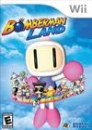

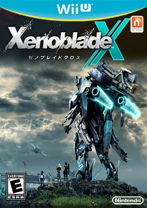
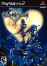
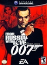
"And this beatifull boxart was unaware what doom and flop were wating it the moment it went out"

Above: still the best game of the year.
| Beuli2 said: It did help to sell the insides |
It's also ALL RED!
What is with all the hate? Don't read GamrReview Articles. Contact me to ADD games to the Database
Vote for the March Most Wanted / February Results
Indeed it is an awesome cover.
I'm just a couple of hours into the game and I'm loving it so far.

Reminds me of the Trilogy boxart. My friend told me that the red part is actually a slip cover covering the real case (the only part of which you can see is her face).


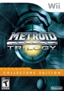
That's cool. Prefer the NA one. Also a couple hours in an loving it so far. And I'm not even a Metroid fan.

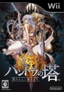
so pretty...
| pariz said: Indeed it is an awesome cover. I'm just a couple of hours into the game and I'm loving it so far. |
Wow... damn it why can't the NA one be so pretty?
What is with all the hate? Don't read GamrReview Articles. Contact me to ADD games to the Database
Vote for the March Most Wanted / February Results


I actually don't like it at all, too bland
Michael-5 said:
Wow... damn it why can't the NA one be so pretty? |
It actually looks as a great book cover, right?
I don't know what's the criteria for game covers and localization, but sometimes one gets to feel it could have been better done.
By instance, look at this:

How in the world does that cover have anything to do with Uncharted 2 aesthetics, how twisted are japanese people supposed to be that this is the means to sell them this game, I just don't know.
About Us |
Terms of Use |
Privacy Policy |
Advertise |
Staff |
Contact
Display As Desktop
Display As Mobile
© 2006-2026 VGChartz Ltd. All rights reserved.

