



Seraphic_Sixaxis on 19 January 2010
 VS
VS 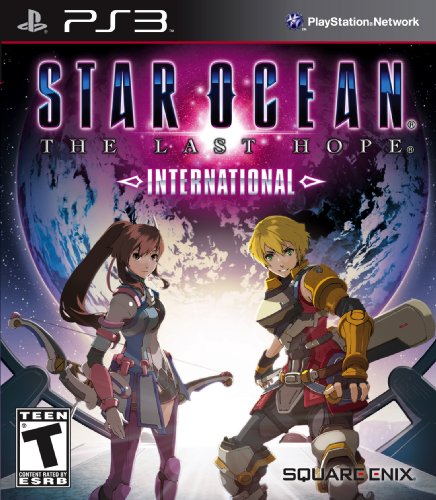
The 360 version is strongly covered in a Neon Green overall color with Edge shadowed out on the front... almost as if hes ashamed...
While the PS3 version is more bright and welcoming, yet at the same time darker both in backround and the titles Neon Pink letters...
Did tri-ace do this on purpose to reach out to 360 owners with the 360's nice Neon green color scheme?
And are they doing the same with the PS3's more darker yet brighter sleeker design?
i never figured Tri-ace to be the Game case dependent type but meh...