
786_ali on 05 September 2009
If the black background where it says PS3 didn't fade out towards the end, it'd look far better.
Initiating social expirement #928719281


If the black background where it says PS3 didn't fade out towards the end, it'd look far better.
Initiating social expirement #928719281


Second one looks like a bad photoshop. Sony really didn't need to change it, I liked it how it was before.


the old one looks much better
mainly coz the logo was down the side aswell
End of 2012 prediction:
xbox 360 : 73-75 million  playstation 3 : 72-74 million wii : 104-105 million
Most hyped for :
Bioshock: infinte, The Last Of Us, Alan Wake's American Nightmare and Agent

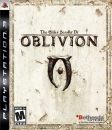


The new box layout is better because it follows the X360 format with all the logos on top horisontally. Vertical logo was always awkward.
But it's sad that they had to destroy a unified format inside a generation with this change.


| Slimebeast said: The new box layout is better because it follows the X360 format with all the logos on top horisontally. Vertical logo was always awkward. |
I was about a minute from saying that..
Sony copies MS
![]() Pixel Art can be fun.
Pixel Art can be fun.


I vastly prefer the old boxart but i guess there is nothing we can do to stop this from happening! 


| Slimebeast said: The new box layout is better because it follows the X360 format with all the logos on top horisontally. Vertical logo was always awkward. |
While ignoring the stuff about it copying 360, I think the horizontal logo is better and yes they have had it since PS1 days


About Us |
Terms of Use |
Privacy Policy |
Advertise |
Staff |
Contact
Display As Desktop
Display As Mobile
© 2006-2025 VGChartz Ltd. All rights reserved.
